


PORTFOLIO
PORTFOLIO
CLIENT
Municipality of Brighton
PROJECT
Rebranding Initiative
DESIGN SOLUTION
Through a competitive bid process, The Blondes Branding & Design was selected to lead the rebrand of the Municipality of Brighton. The goal was to refresh a visual identity and communications system that had become dated and no longer reflected the vibrancy of the community it represents.
Our approach began with discovery. We facilitated a series of focus groups and phone interviews with municipal staff, key stakeholders, local leaders, volunteers, and influential members of the community. These conversations were instrumental in uncovering shared values, perceptions, and aspirations for Brighton’s future. To ensure broader community input, we also launched a public survey, inviting residents to share their perspectives and priorities. This research provided a well-rounded understanding of how Brighton is seen from various viewpoints.
From these insights, we developed a comprehensive Findings Report, outlining key themes and strategic recommendations to guide the direction of the new brand. This foundation ensured that every creative decision moving forward was rooted in authenticity and aligned with the community’s voice.
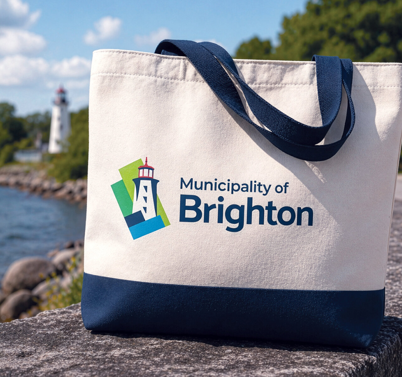
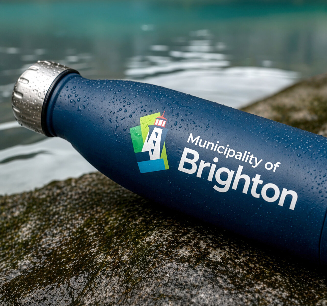
The resulting visual identity is bold, modern, and deeply connected to place. At its core is one of Brighton’s most recognizable landmarks, the Presqu’ile Lighthouse, paired with an abstract representation of the municipality’s perimeter through dynamic colour blocking. The identity strikes a balance between heritage and progress, creating a distinctive and memorable brand.
The new brand reflects both the community and the organization that serves it. It communicates a unified message, celebrates local pride, and clearly defines what makes Brighton a compelling place to live, work, visit, and invest.
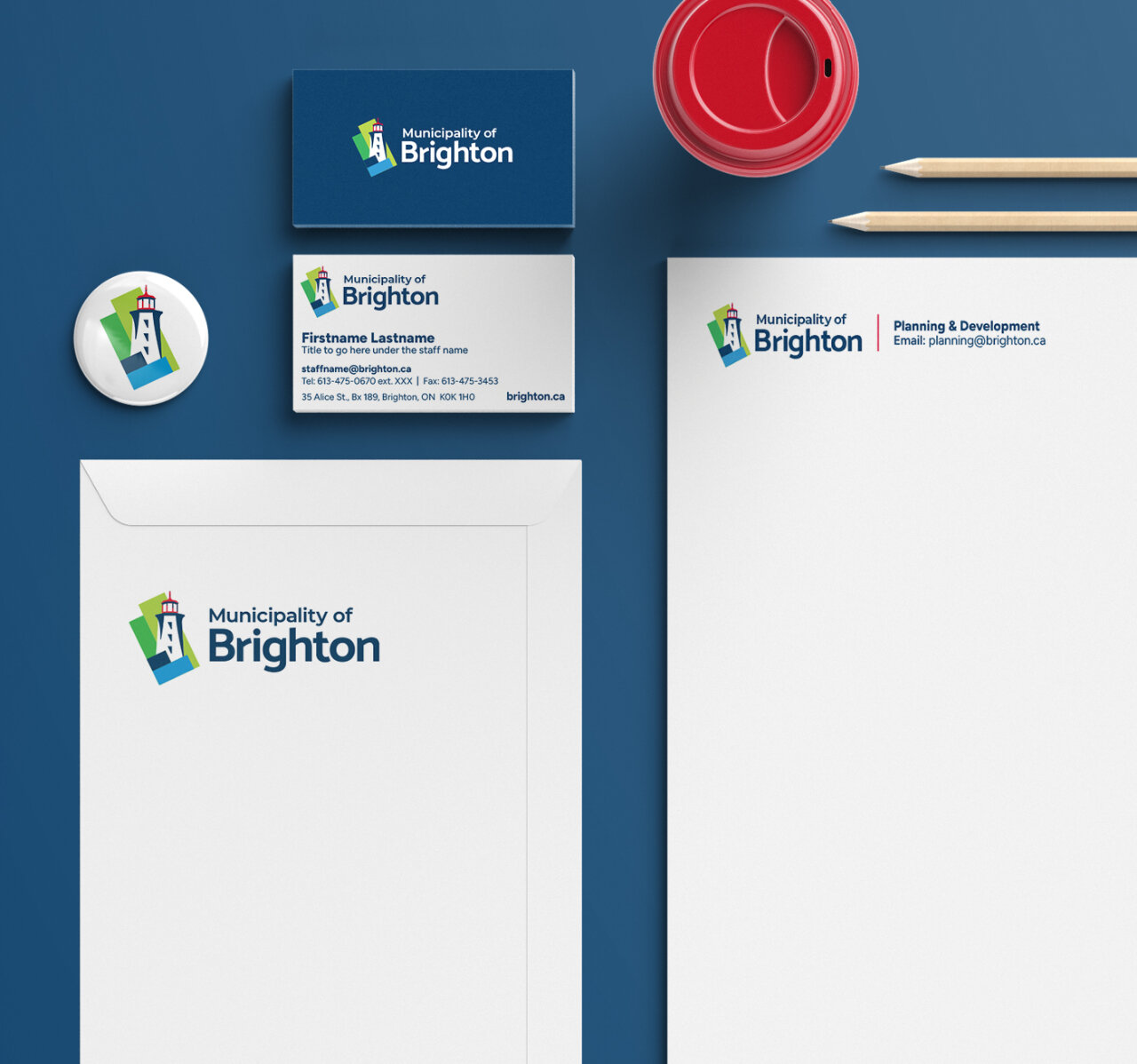
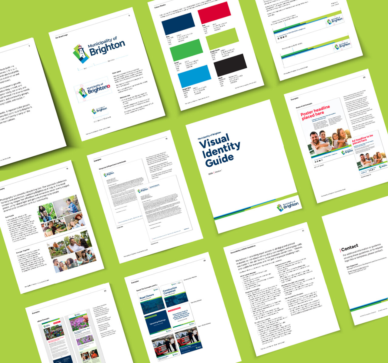
Beyond the core identity, we developed a full suite of branded materials, including stationery and adaptable marketing templates for posters, social media, newsletters, and e-blasts.
To support long-term success, we created a detailed Visual Identity Guide, ensuring clarity, consistency, and ease of use across all applications. The guide outlines clear rules for logo usage, typography, colour, imagery, and layout systems, while also providing practical examples to help staff and partners confidently apply the brand across both print and digital platforms.
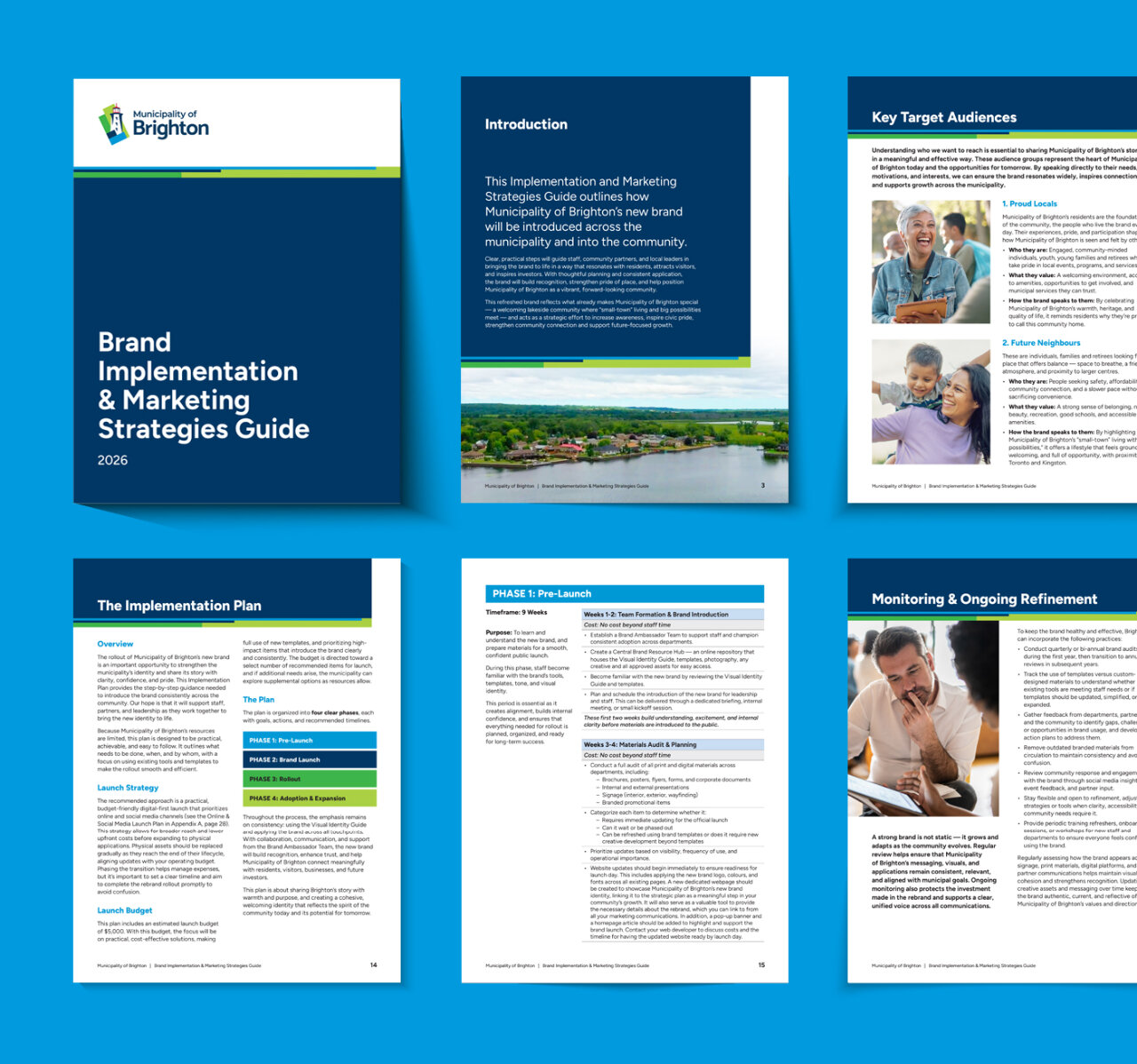
Finally, we delivered a comprehensive Brand Implementation & Marketing Strategies Guide, outlining practical steps for rolling out the new brand across the municipality and into the community. The guide supports both the launch phase and long-term brand stewardship, helping ensure consistent application, sustained engagement, and continued growth of the brand over time.
The result is a cohesive, future-focused brand that has been enthusiastically received—one that the Municipality of Brighton can confidently build on for years to come.
CATEGORIES
Research, Brand Identity Design, Messaging, Collateral & Templates, Guidelines & Implementation
Stand out and make some noise with truly impactful design.
Give us a holler and let’s start the conversation.
 BACK
BACK