


PORTFOLIO
PORTFOLIO
CLIENT
University of Guelph's Research Innovation Office
PROJECT
Program Rebrand
DESIGN SOLUTION
The Blondes – Branding & Design partnered with the Research Innovation Office at the University of Guelph to reimagine and reposition a long-standing student competition, previously known as Project SOY Plus, for a new generation of innovators. The engagement began with strategic name development, recognizing that the program required a distinctive and future-facing identity that could encapsulate sustainability, creativity, and
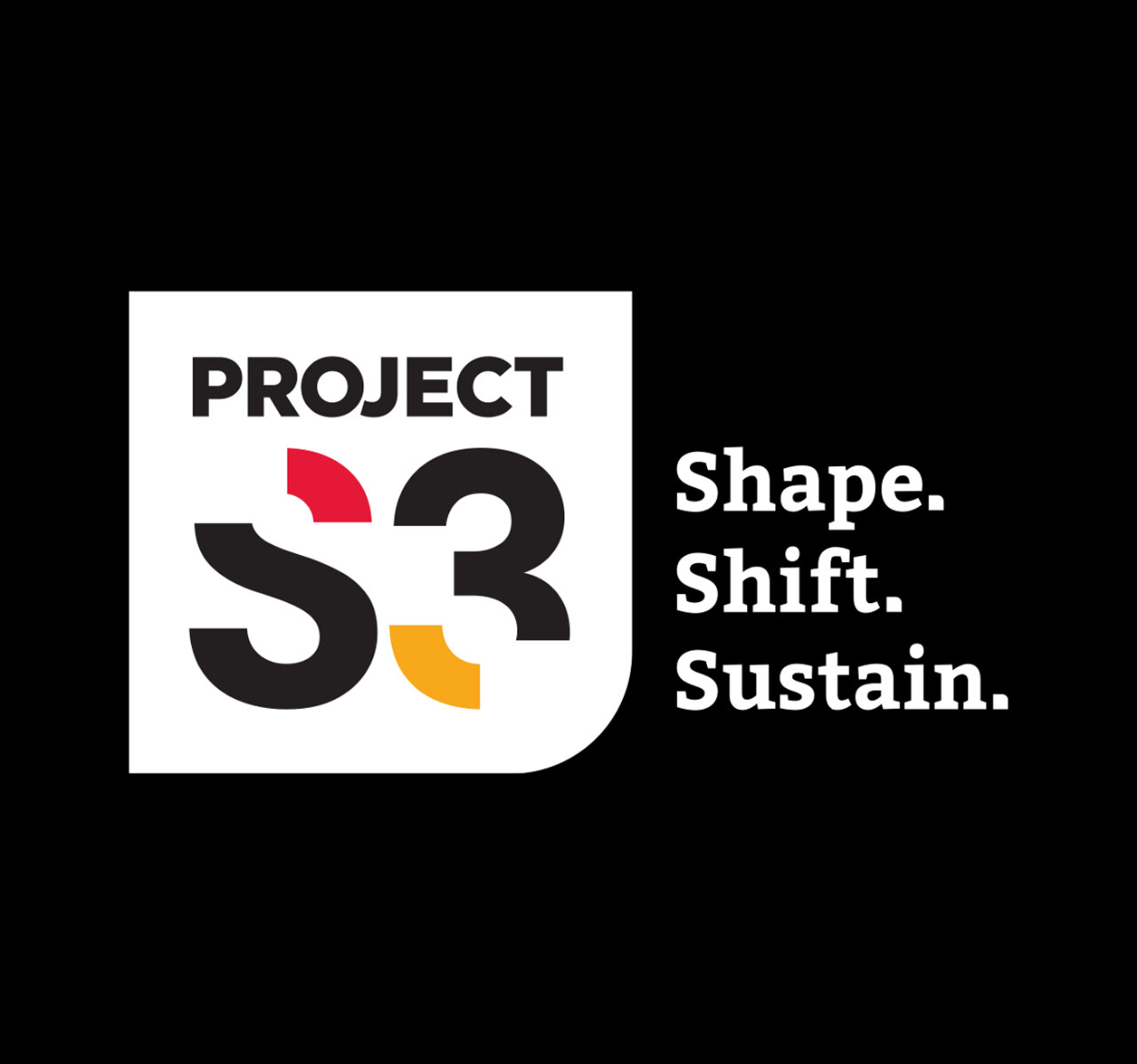
real-world impact. The resulting name, Project S3 (Shape, Shift, Sustain),is concise, memorable, and rich with meaning. Each word reflects a core dimension of the program: shaping ideas through creativity, shifting perspectives through innovation, and sustaining solutions for long-term impact. The name establishes a strong narrative foundation while lending itself naturally to visual expression and storytelling.
Building on this strategic platform, we developed a bold and adaptable visual identity anchored by a distinctive Project S3 logo. The design features a strong, contained lock-up that creates immediate recognition and presence across applications. Subtle negative spaces within the S3 form symbolize discovery and iteration, illustrating the role students play in uncovering new ideas and taking incomplete concepts forward toward meaningful solutions. A softened curved corner introduces approachability and balance, reinforcing the program’s supportive and exploratory nature.
The colour palette, in line with the University’s established brand standards, combines red, yellow, black, and white to convey energy, optimism, clarity, and credibility. This ensures strong institutional alignment while allowing the program to maintain its own recognizable voice. Supporting typography pairs contemporary geometric forms with a more grounded academic typeface, bridging innovation and academic rigour.
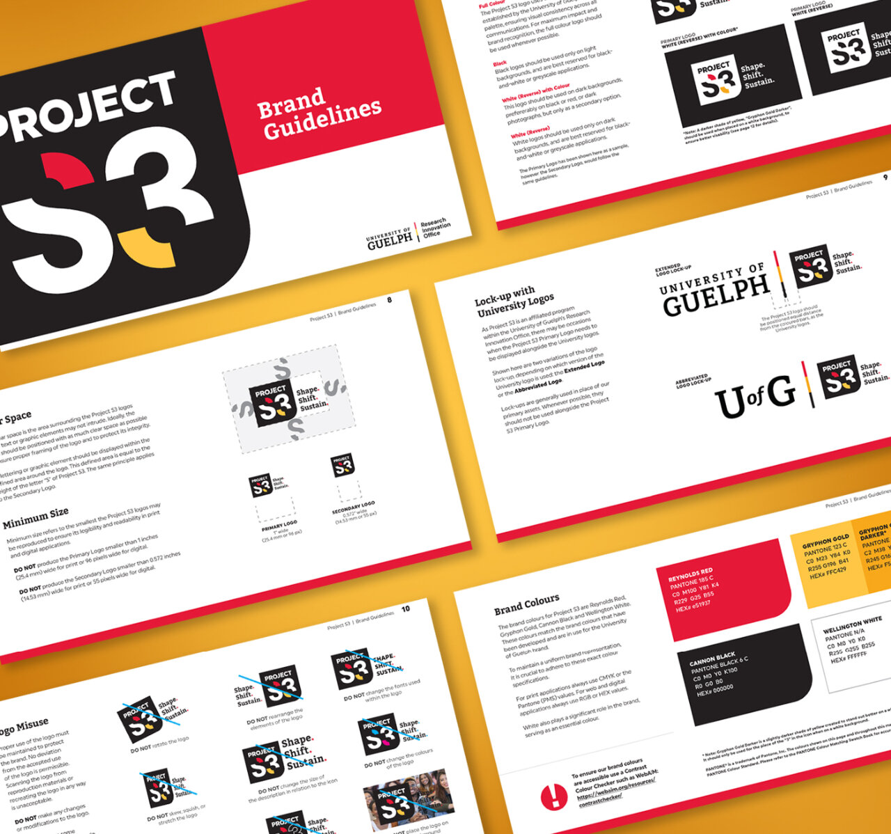
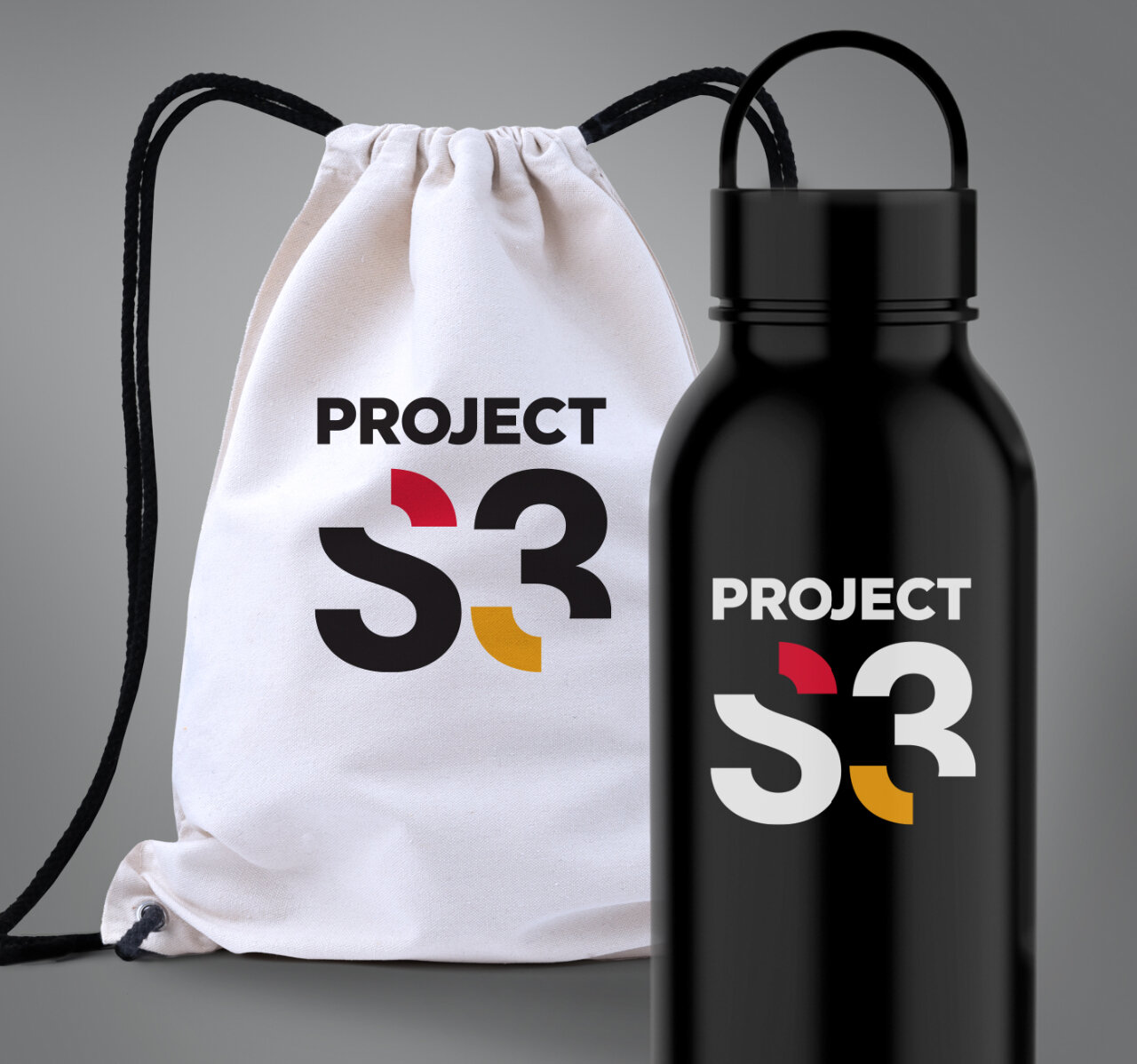
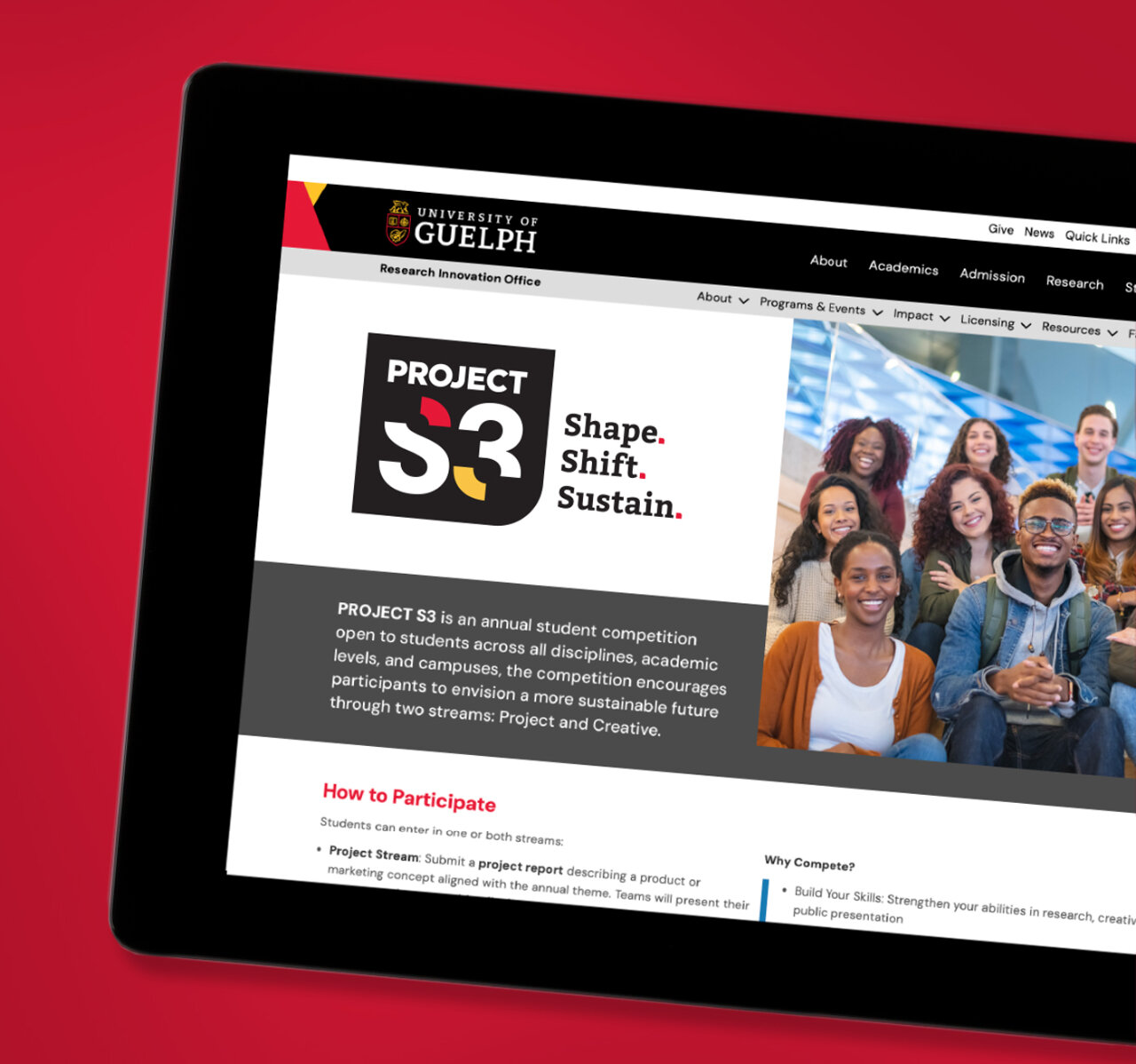
Comprehensive brand guidelines were developed to ensure consistency and scalability across digital platforms, print materials, and event environments. The result is a cohesive and flexible identity system that elevates the program’s visibility, strengthens its connection to the University, and resonates with a diverse student audience. Project S3 now stands as a modern, engaging, and future focused brand. It inspires participation and reflects the transformative potential of student led innovation.
CATEGORIES
Name Generation, Logo Design, Brand Guidelines
Stand out and make some noise with truly impactful design.
Give us a holler and let’s start the conversation.
 BACK
BACK