


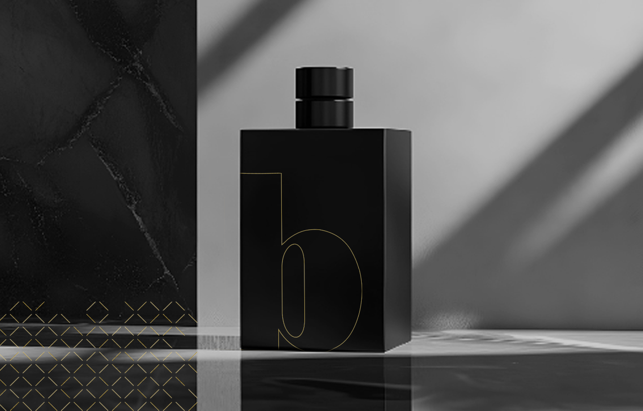
When choosing colours to represent your brand, you need to go beyond just a shade. You need something that is a statement.
Black is a colour (or shade, depending on who you ask) that represents a lot of things. Mystery, sophistication, elegance, and strength.
While it does not have the same ‘pop’ of vibrant purple or periwinkle, it still packs a powerful punch when used in branding and design.
However, if you do not utilize the colour black properly in your branding, you could potentially be missing out on some serious colour psychology perks, along with cultural significance that can create a big impact.
Whether you want your brand to exude luxury, a modern aesthetic, or even appear a little bit on the edge, utilizing the colour black strategically can make a big difference in how people perceive your brand.
If colour theory and captivating audiences with your brand intrigues you, you are going to want to read this blog. The Blondes will take you through the details and break down why brands love black.
Colour psychology: How black commands power, intrigue, and inner strength
While black is a simple colour, it is also extremely memorable. It communicates a myriad of messages, ranging from the severe (such as grief or mourning) to extreme sophistication (exclusivity and luxury).
While many big brands use black in their branding and design, smaller and mid-sized companies have also taken advantage of the iconic shade.
Here are some examples:
Death Wish Coffee: Uses black-heavy packaging and branding to emphasize boldness, intensity, and edge.
Liquid Death: Combines black visuals with punk-inspired design to create a rebellious, disruptive identity.
Allbirds: Frequently uses black in minimalist product photography and web design to communicate sophistication and simplicity.
MVMT: Relies heavily on black backgrounds and monochrome visuals to position itself as stylish and premium.
Bevel: Uses matte black packaging and an understated design to reinforce luxury and precision.
Drunk Elephant: Uses black strategically in packaging and typography to create a polished, upscale feel.
Native Deodorant: Pairs black typography with minimalist layouts to make branding feel clean and trustworthy.
Brooklinen: Uses black-and-white visuals and elegant contrast to convey comfort and modern luxury.
Ridge: Features dark, masculine branding with black product finishes to communicate durability and confidence.
Colour misconceptions: The history of black
Unfortunately, black has had a history of being associated with mourning, bad luck, evil, and death. Where does this misconception around the colour black come from? Let us do a quick exploration of the history of the colour black and why it sometimes gets a bad reputation:
Association with darkness and the unknown: Black is naturally tied to night, shadows, and the absence of light, which historically created fear and uncertainty.
Connection to mourning traditions: Many Western cultures wear black at funerals and during periods of grief, reinforcing the association with death and loss.
Religious symbolism: In various religious texts and traditions, black has been used to symbolize sin, darkness, temptation, or spiritual absence.
Folklore and superstition: Black cats, black birds like ravens, and dark omens have long appeared in myths tied to bad luck or misfortune.
Visual contrast with light: Since light tones traditionally symbolize clarity and innocence, black shades became their natural contrast in art, literature, and storytelling.
Use in villain imagery: Movies, books, and other media often dress villains in black to visually convey danger, power, or secrecy.
Historical fear of the night: Before modern lighting, darkness made people vulnerable to predators, crime, and the unknown, deepening black’s negative symbolism.
Connection to plague and disaster: Events like the “Black Death” strengthened the colour’s association with suffering, disease, and mortality.
Psychological impact: Black can feel heavy, intense, or intimidating, which contributes to its connection with fear and negativity.
Symbol of secrecy and concealment: Because black can hide details and obscure visibility, it became associated with mystery, deception, and hidden danger.
However, in the modern age, the perception of black has evolved to carry a sense of high status and sleekness. From luxury vehicles to cutting-edge tech, black has long been associated with authority, sophistication, and unmistakable confidence. Now, people associate black with elegance and timelessness; think of tuxedos and black-tie parties where the champagne is plentiful, and the food is gourmet.
Utilizing black in branding and design
If you are looking to showcase your brand as an authority, elegant and even strong, black is an excellent choice to incorporate into your branding and design. However, that does not mean it should be overused; rather, the colour should be used strategically alongside other design elements.
How to effectively use black in visual design
While it may be tempting to go for an all-black design (which is not a faux pas, necessarily), there are other ways to strategically incorporate elements of black into designs in unique and interesting ways.
Pair black with bold colours
Black pairs amazingly with vivid shades of red, pink, orange, and green. This creates an eye-catching contrast and a polished visual impact. This can be used to create logos, typography, and stylish graphics, making them easier to remember.
Use it to draw attention
In marketing and UI/UX design, black is often used to emphasize important elements, such as headlines, packaging, and call-to-action buttons. Its strong contrast naturally guides the viewer’s focus.
Add depth to compositions
Black can create a sense of dimension and structure in photography, illustration, and graphic design. Combining multiple dark tones or subtle gradients adds richness and visual layering.
Soften it with lighter elements
Excessive use of black can feel heavy or overpowering, so balancing it with neutrals, lighter shades, or textured details helps maintain a clean and approachable design.
Coordinate with your palette
When incorporating black into a colour scheme, think about how it interacts with surrounding tones. It can enhance minimalist monochrome designs or ground brighter, more energetic palettes with sophistication and balance.
Boost brand engagement with sleek black promotional products
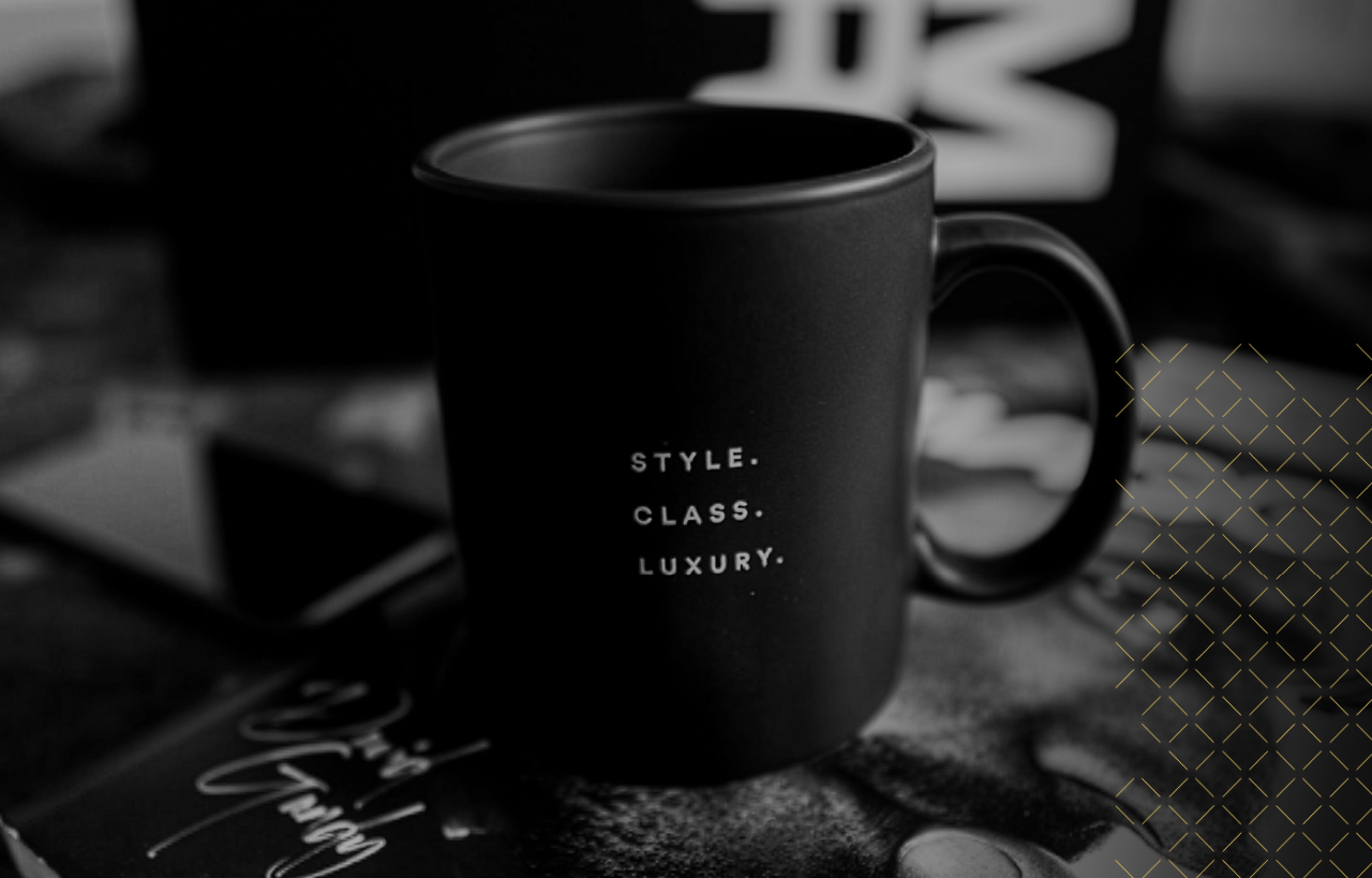
Promotional products can have a serious impact on your consumer base. When they mirror the brand's unique colours and design, they create a strong connection between the company and its product. A black product with a unique, colourful design with black branding has the potential to stand out and give it a more professional/luxurious appearance.
Products that have black promotional items and designs come with several perks when it comes to connecting with the consumer:
Black products create a sense of luxury and sophistication that consumers naturally associate with quality and lasting value.
Their versatility appeals to audiences across nearly every industry, from corporate and tech to fashion and lifestyle brands.
Black designs feel appropriate for virtually any event or campaign, making them easy for consumers to connect with year-round.
Coloured logos and branding elements stand out sharply against black backgrounds, helping brands become more memorable and visually impactful.
Consumers often associate black with sleekness, professionalism, and modern style, giving products a more polished appearance.
With countless product styles and customization options available, black works seamlessly across a wide range of promotional items and branded merchandise.
Whether you want consumers to think of your brand as luxurious or visually impactful, you can trust that black is a brand favourite for connecting with your customer base.
However, many smaller to mid-sized companies (especially new ones) may be worried about handling the contrast between the black design and text visibility. After all, many people prefer “dark mode” settings on their smartphones and computers, while others find the contrast jarring.
How to make text stand out properly on black promotional products
Readability is essential when working with a black design. Especially when it comes to printing text/graphics on a black background. That is why it is important to use lighter text colours to make it easier to read. For readability and accessibility, it is also important to avoid very thin fonts, as they can be difficult to read, especially for those who are visually impaired. All designs should also be reviewed to ensure the final product looks the same after a print preview before production begins.
Not sure where to start? The Blondes got you.
If you do not know where to start when it comes to branding and design, you can rely on The Blondes. Our team of artists and highly skilled professionals have years of experience crafting unique and unforgettable branding and design elements. Great branding and design should leave a lasting impression, stand out effortlessly, and embrace originality without hesitation; this philosophy is at the core of The Blondes. We believe in creating a branding and design plan that works for you, captures your mission, and brings the right customers to your business.
If you want to build out a brand that speaks loudly, whether it is a black branding and design approach or something else, you can trust our team to have your best interest at heart. Contact us today.