


PORTFOLIO
PORTFOLIO



CLIENT
Venture Muskoka
PROJECT
Rebrand
DESIGN SOLUTION
A strong regional brand should do more than identify an organization, it should communicate purpose, inspire confidence, and create lasting recognition. Venture Muskoka, a partnership of six municipalities, needed a modern identity to reflect its role in attracting investment, supporting business growth, and promoting the region as an exceptional place to work, live, and invest. The goal was to create a brand that balanced professionalism with approachability while also capturing the energy, opportunity, and lifestyle that define Muskoka. The new brand also needed to feel vibrant, contemporary, and welcoming to entrepreneurs, investors, businesses considering relocation, and professionals looking to build a future in the region while respecting the communities it represents. Just as importantly, the identity had to be flexible enough to perform consistently across digital platforms, print materials, signage, merchandise, presentations, and community initiatives.
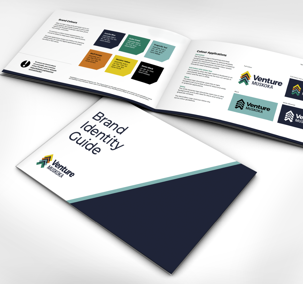
The icon centres on a series of upward-pointing arrows that symbolize growth, progress, opportunity, and momentum. Layered together, the arrows form an abstract, subtle tree-like icon to reference Muskoka's natural landscape and the region's commitment to sustainable economic development. Their overlapping arrangement represents the many resources, partnerships, and collaborative efforts that support business success while reinforcing the shared vision of the participating municipalities. A refreshed colour palette further strengthens the brand, with new vibrant blues, teals, greens, oranges, and yellows inspired by Muskoka's lakes, forests, autumn landscapes, and sunshine. The expanded palette creates a more dynamic, approachable brand while clearly differentiating Venture Muskoka from related regional organizations. Together, the colours and icon communicate optimism, innovation, and the balance between economic opportunity and an exceptional quality of life.
A refreshed colour palette further strengthens the brand, with new vibrant blues, teals, greens, oranges, and yellows inspired by Muskoka's lakes, forests, autumn landscapes, and sunshine. The expanded palette creates a more dynamic, approachable brand while clearly differentiating Venture Muskoka from related regional organizations. Together, the colours and icon communicate optimism, innovation, and the balance between economic opportunity and an exceptional quality of life. To support the long-term success of the rebrand, a comprehensive
brand guidelines document was also developed, outlining logo usage, colour standards, typography, graphic elements, and application best practices. The guidelines will help to ensure a consistent and recognizable brand across every touchpoint, providing Venture Muskoka a cohesive visual brand identity that will support future growth and strengthen regional recognition for years to come.
CATEGORIES
Rebrand, Visual Identity, Logo Design, Icon, Brand Identity Guide, Brand Guidelines, Brand Refresh
Stand out and make some noise with truly impactful design.
Give us a holler and let’s start the conversation.