Waterloo Region
Community Foundation
REBRAND • CORPORATE • BRAND IDENTITY GUIDELINES • BANNER DESIGN
Waterloo Region Community Foundation (WRCF) collaborates with partners to develop
and implement forward-thinking innovative solutions that make a positive difference in
the lives of people and families across our region. They are focused on making
philanthropy easy for individuals and companies to support organizations and issues
they care about, to help build a strong and vibrant community that will help shape the
future for generations to come.


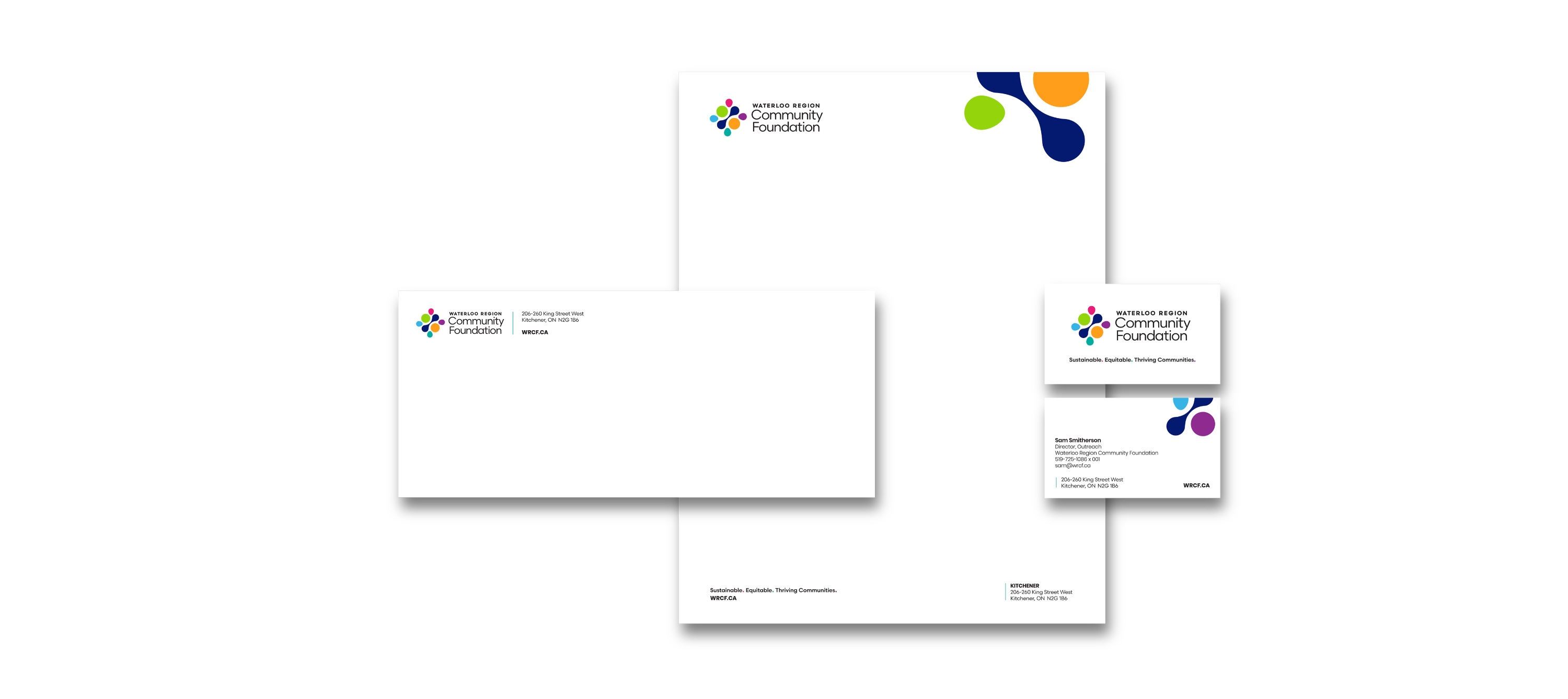
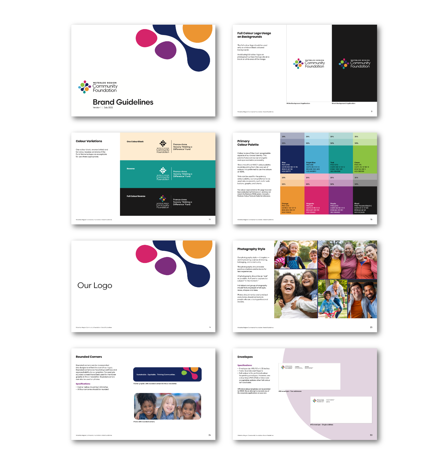
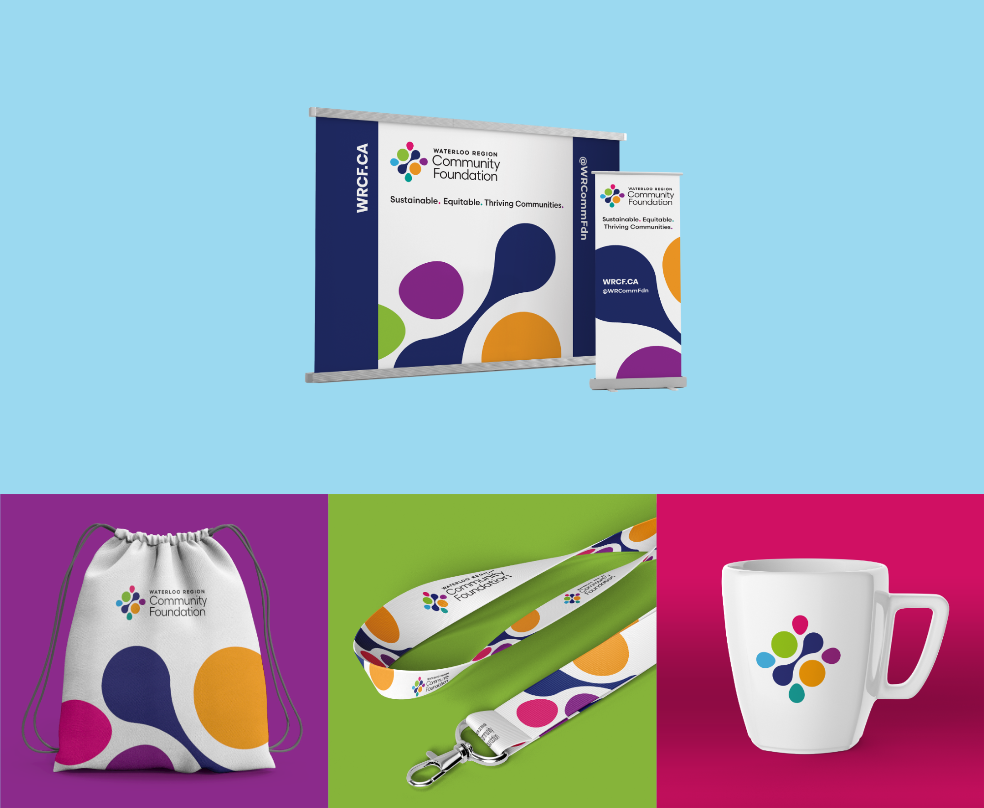
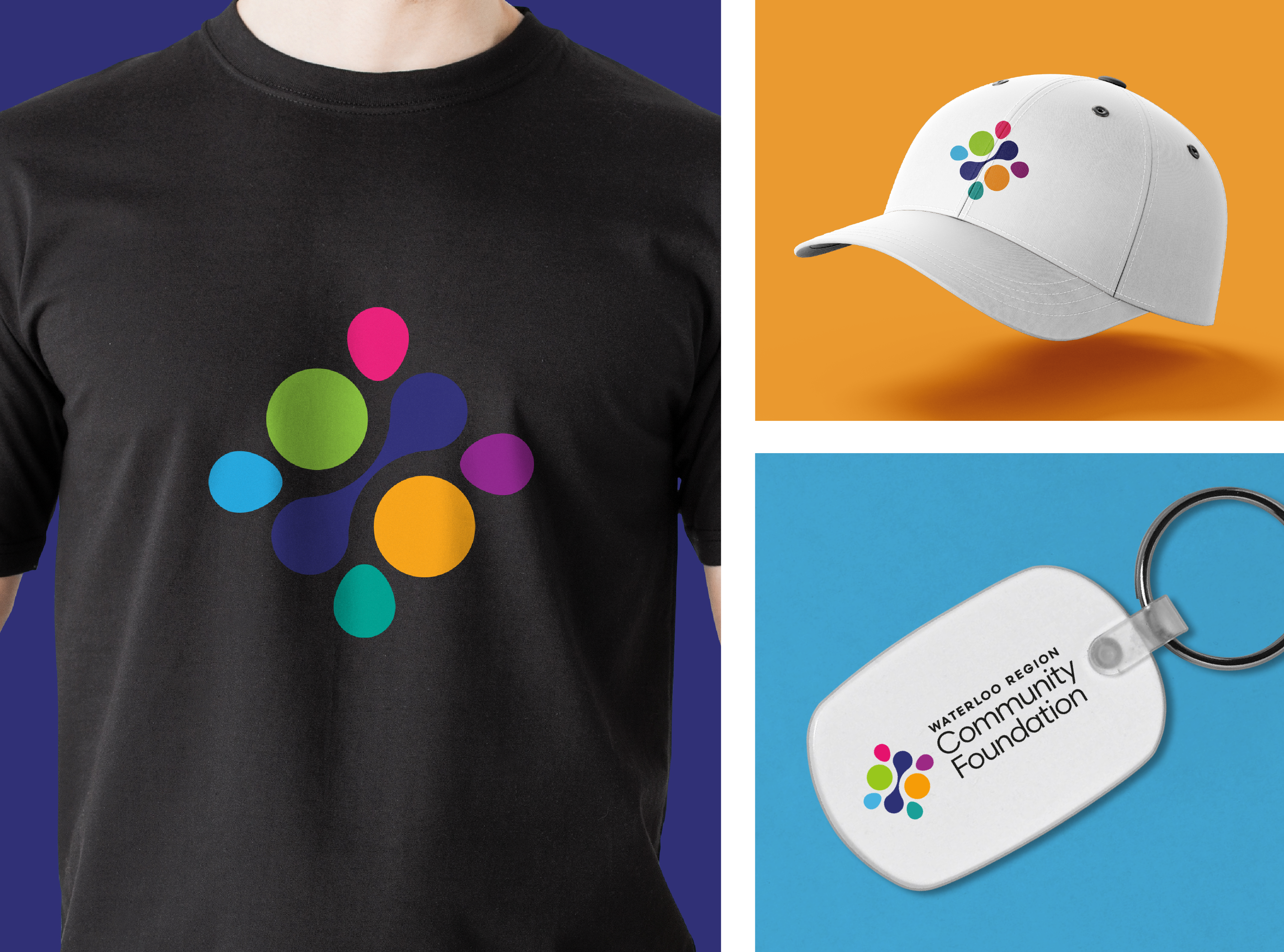
THE BRIEF
To develop a distinctive, engaging and memorable brand logo, style guide and additional marketing materials that will capture the unified foundations of Cambridge & North Dumfries Community Foundation (CNDCF) and Kitchener Waterloo Community Foundation (KWCF) and align their organizations vision, mission and values. The new organization is now known as Waterloo Region Community Foundation (WRCF).
THE APPROACH
This logo with its vibrant colours and modern design immediately feels inviting and friendly. Although slightly structured in design, the icon has an organic feel to it due to the combination of rounded shapes. The symmetrical or mirror-like layout of the icon also speaks to partnerships. The use of several colours suggests diversity and many people coming together to support and meet the needs of the community.
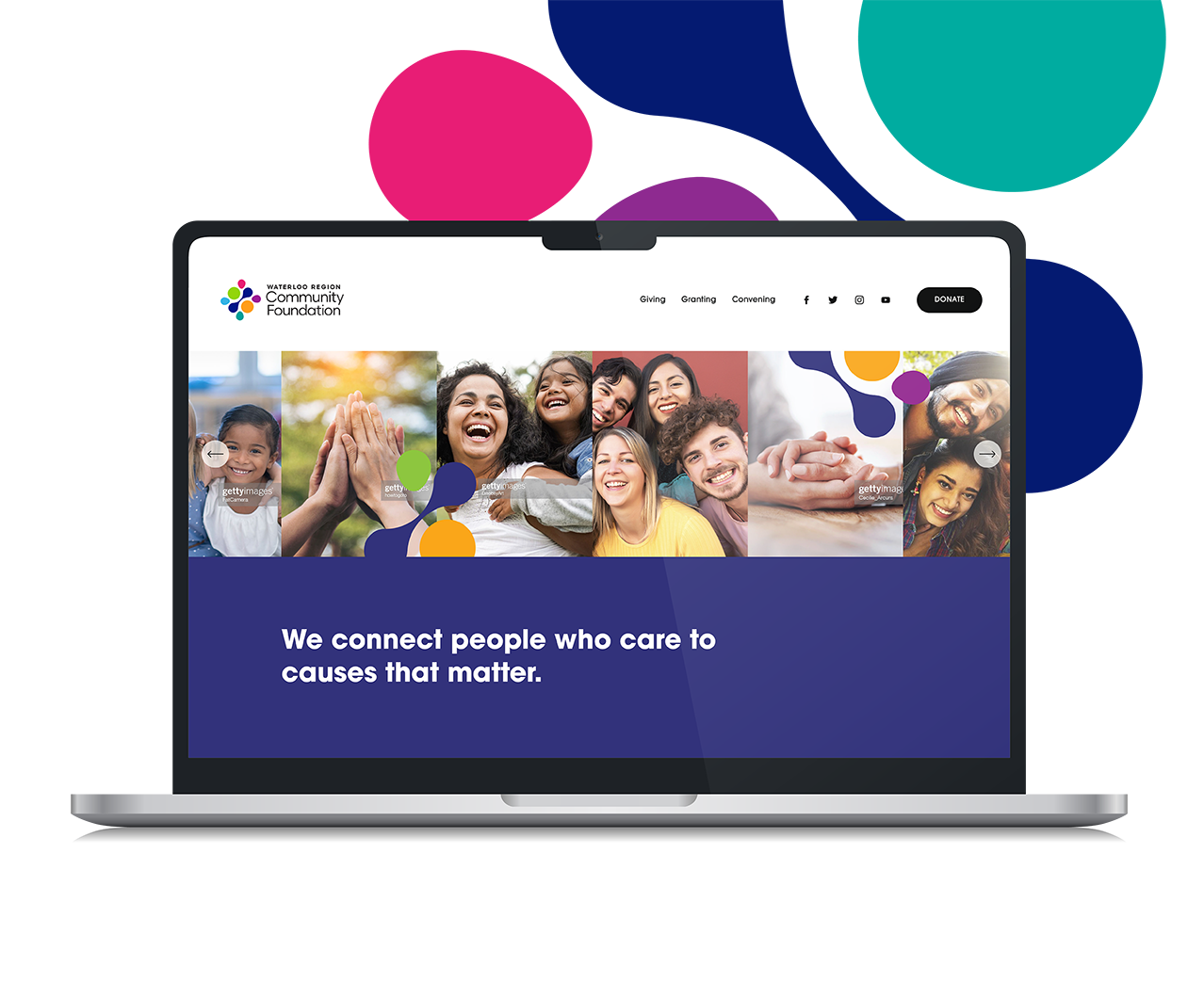
THE RESULT
A new logo that reflects who WRCF is and what they stand for — community, partnership, approachability. The new brand image has been extremely well received and will help WRCF make a strong and memorable impact in the community.