College of Veterinarians
OF Ontario
REBRAND • CORPORATE IDENTITY • BRAND GUIDELINES • REPORT DESIGN • PRINT MATERIALSThe College of Veterinarians of Ontario (CVO) regulates the delivery of veterinary medicine in Ontario, seeking to understand the risks involved in the practice of veterinary medicine and collaborates with partners to develop solutions which reduce the potential for harm to animals and people.


THE BRIEF
CVO sought a brand identity revamp that aligned more closely with the organization's modern, innovative, and forward-thinking values as a regulatory body. The updated brand needed to be versatile across various communication devices, instantly recognizable, and possess a clean aesthetic.


THE APPROACH
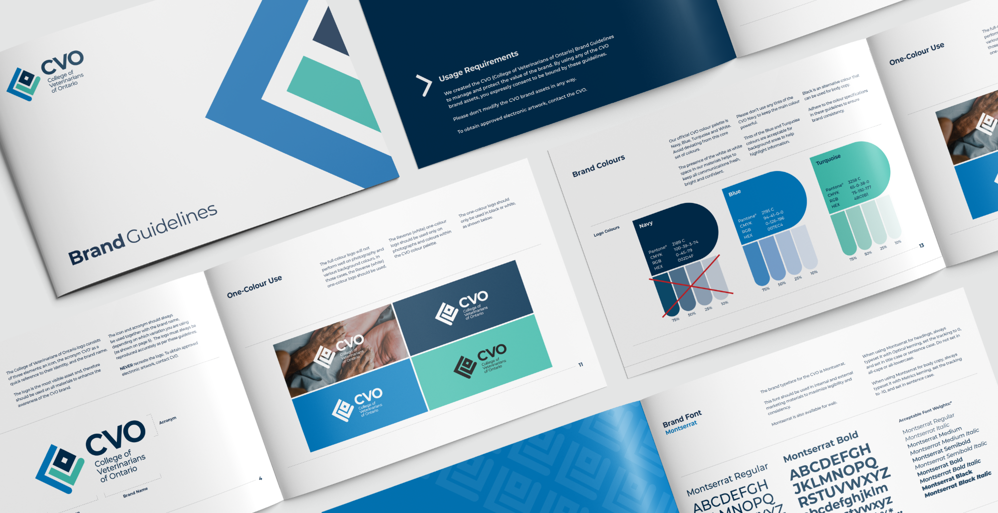
Creating an identity that harmoniously unites to form a singular icon, symbolizing the governing practice of veterinary medicine working together in collaboration with partners and veterinarians. We wove the CVO letters into a distinctive and proprietary icon. The abstract ‘C’ on the left side, represents an open hand that extends to supports all members of CVO. The members, symbolized with a silhouette of a person, are formed by the ‘V’ and ‘O’. Infusing the brand with a vibrant spectrum of colors, from a lively blue signifying health, a profound blue representing knowledge, to a soothing teal embodying unwavering support, we've breathed life into a brand that exudes freshness and contemporary allure.
THE RESULT
Our design approach not only revitalizes CVO's brand but also strengthens its position as a modern and forward-thinking regulatory body.