Paradigm Transportation Solutions LIMITED
BRANDING • LOGO • WEBSITE • BRAND GUIDELINES • BROCHURE • BANNER STANDS • ADVERTISMENTS
Paradigm Transportation Solutions Limited specializes in transportation, traffic, transit and parking planning. Paradigm is dedicated to providing cost-effective, creative, innovative, technology-based and environmentally responsible transportation solutions.

THE BRIEF
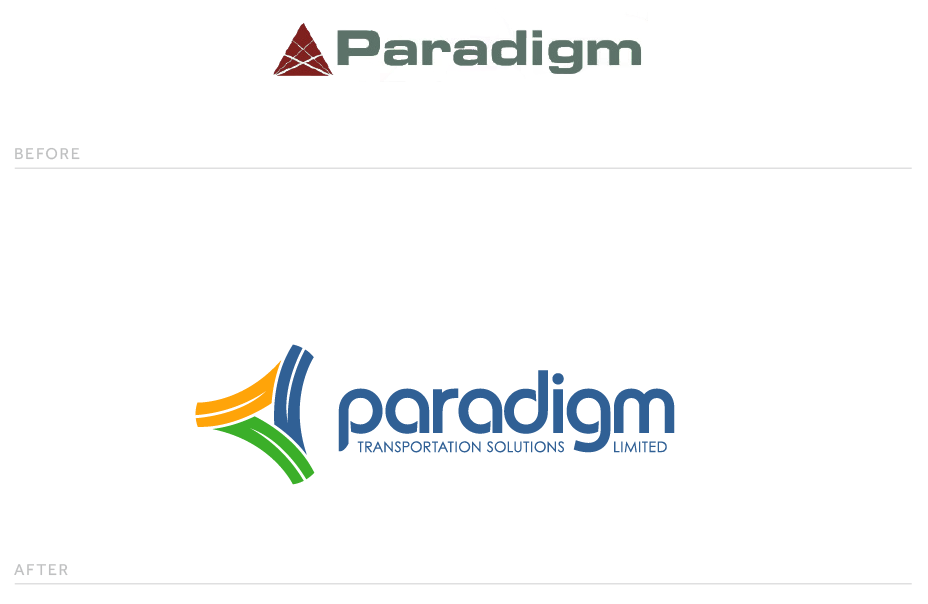
Paradigm came to us with two goals in mind: to modernize and elevate the brand by challenging traditional industry-based design. This new design approach aimed to reinforce Paradigm’s dedication to creativity and innovation.
THE APPROACH
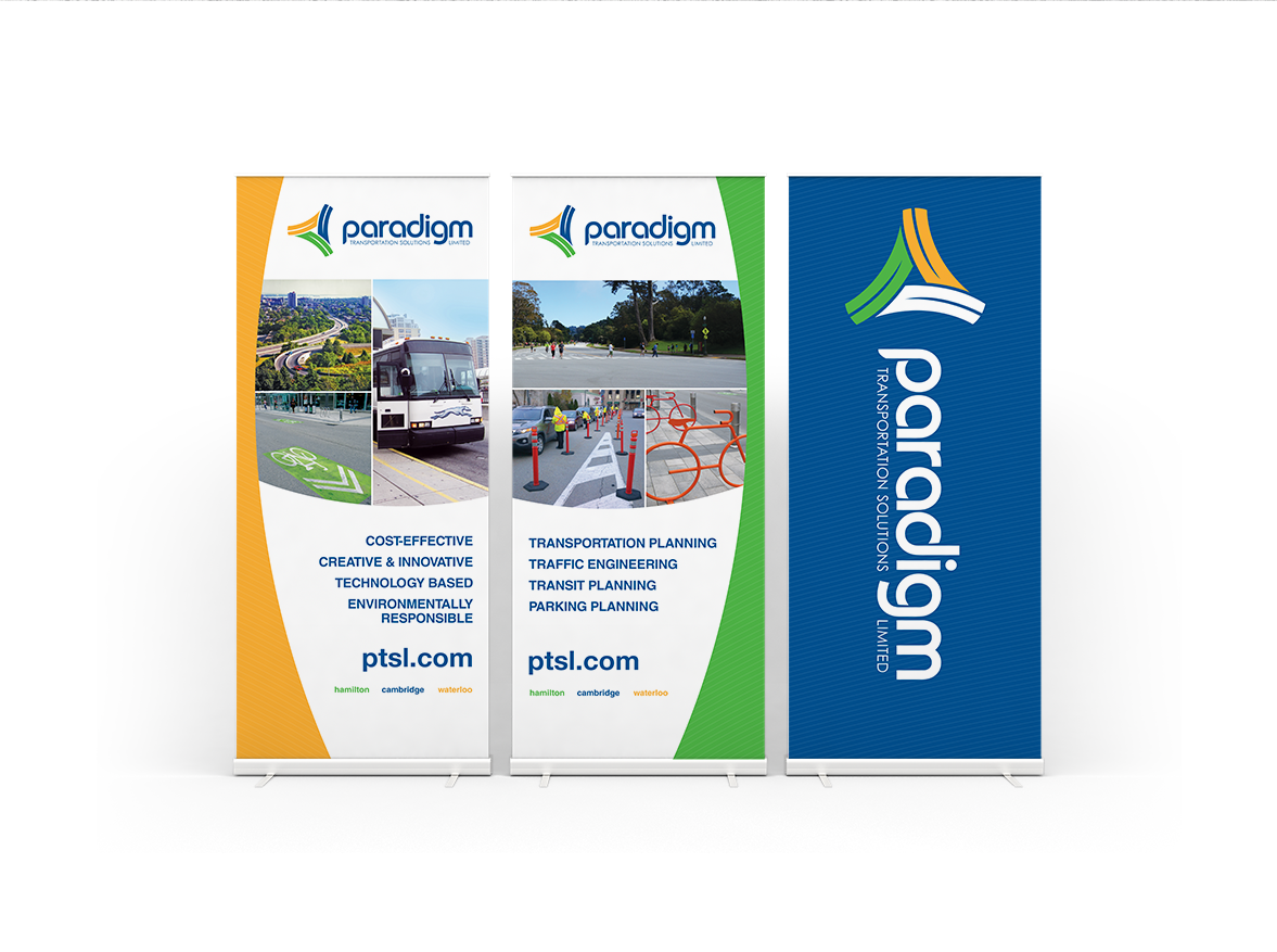
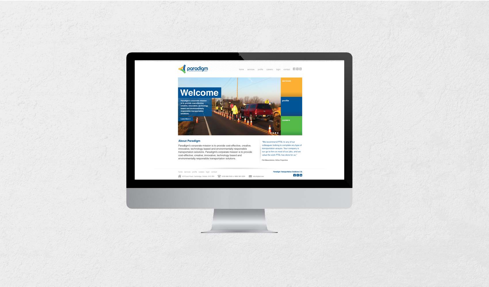
New life has been brought to the Paradigm brand through a forward-thinking design plan. By implementing a vivid new colour palette, the brand's personality and image received a much needed upgrade. The combination of yellow, blue, and green is not only unique to the transportation industry, but these colours support Paradigm's mission to stand apart from the competition and provide innovative solutions.
THE RESULT
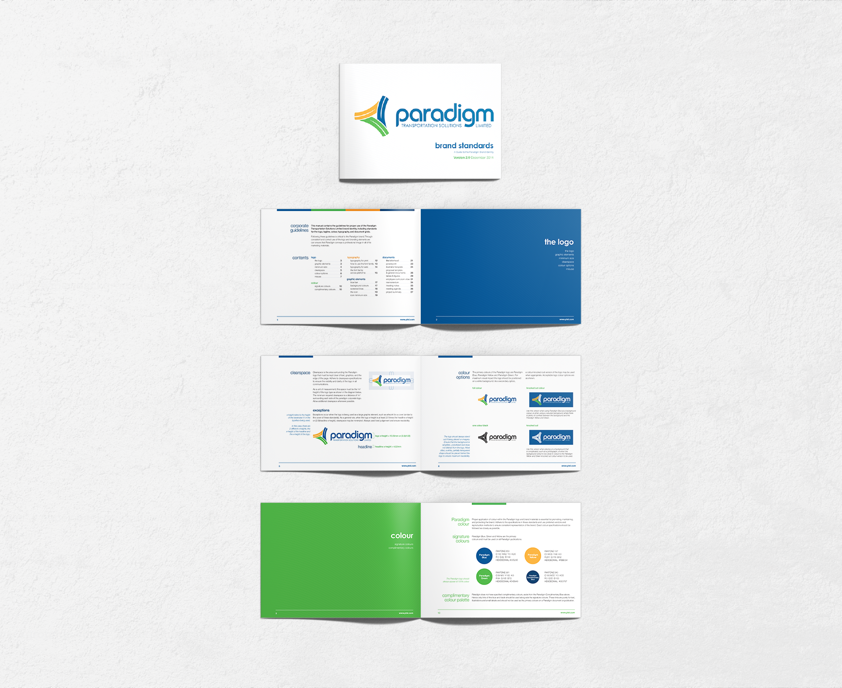
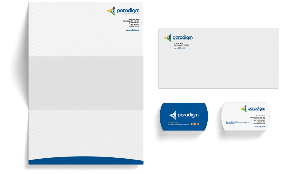
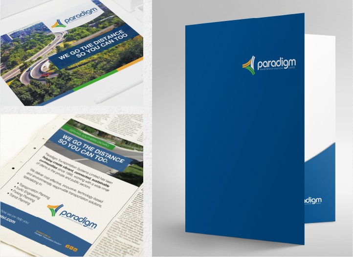
This successful rebrand uses whitespace to maintain Paradigm's sense of modern professionalism. Sleek layouts make content easy to understand while maintaining the high standards of both Paradigm as well as their clients. The new brand has modernized the company's professional image while leaving room for future growth and innovation.