NEO DEVELOPMENTS INC.
BRANDING • SIGNAGE • PRINT
NEO Developments Inc. designs and builds sophisticated, sustainable homes for clients who value quality modern design and seek the extraordinary, everyday.


THE BRIEF
NEO Developments needed a brand identity that would appeal to NEO — or “New Economic Order” — consumers: highly motivated city-dwellers who love to entertain, and value quality over quantity, especially when it comes to their homes. The design needed to be innovative, sophisticated, and modern, yet classic enough to withstand shifting trends in the housing development market. It had to express the company’s dedication to providing a truly personalized service, as well as its commitment to environmental sustainability.
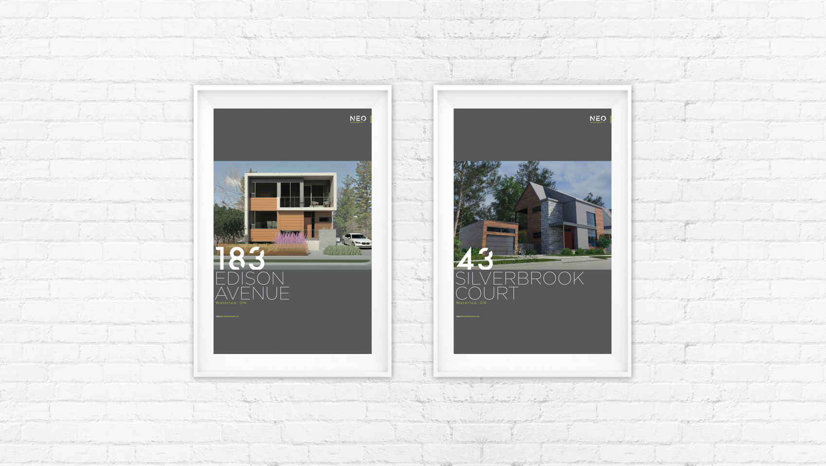
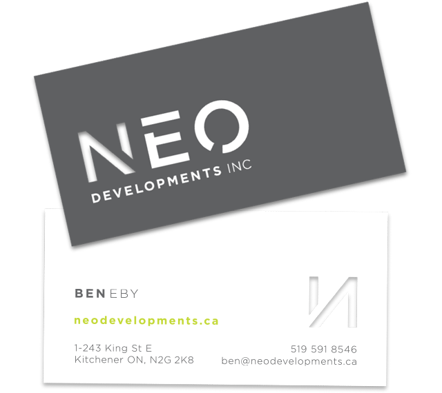
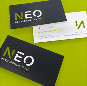
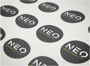
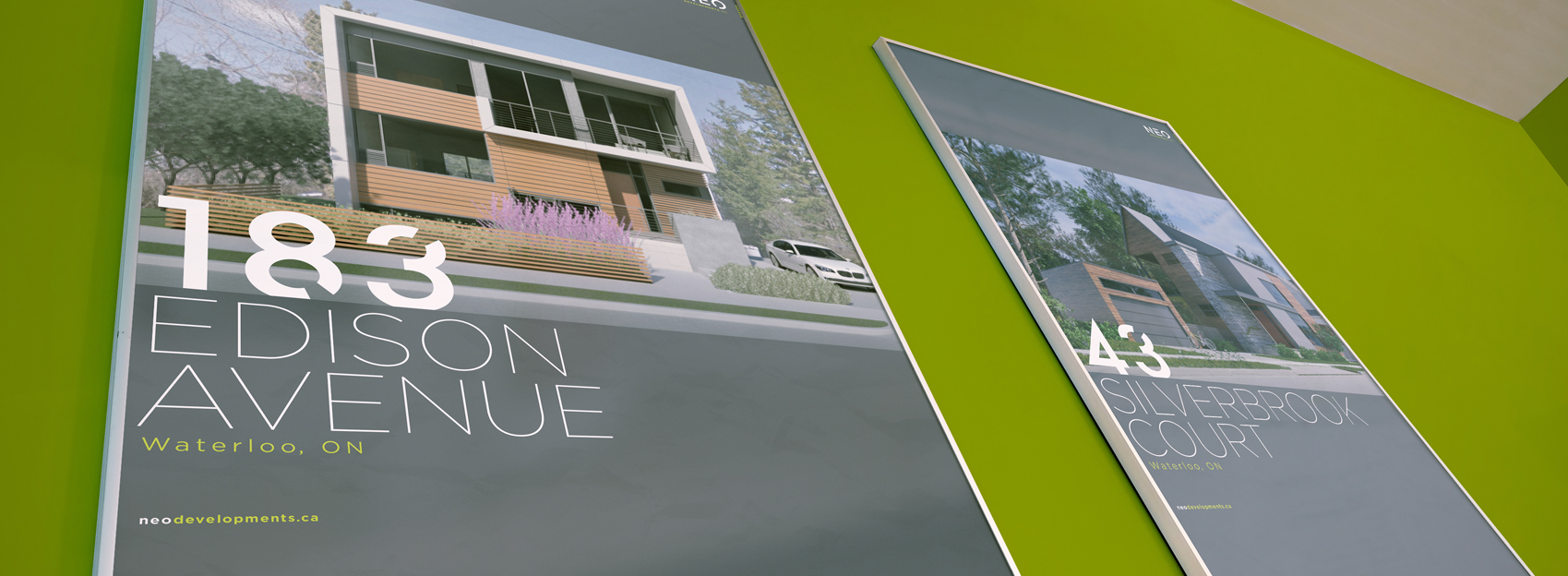
Appealing to the consumer’s environmentally friendly side, a bright and fresh green accent colour calls to mind one of the company’s core values.
THE APPROACH
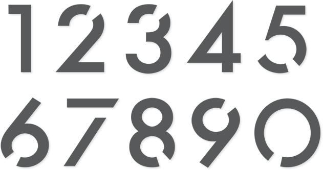
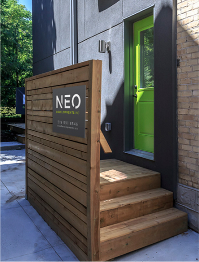
A sleek grey background lends each item an air of urban sophistication, while clean white lines and modern fonts are reminiscent of the client’s minimalistic, contemporary home designs.
THE RESULT
We’ve built a brand to reflect the sophistication and authenticity of the NEO target market — modern and fresh, with a great deal of attention paid to every detail.