FERRANTE CHEESE
BRANDING • PACKAGING • PHOTOGRAPHY
Ferrante Cheese is recognized for its premium selection of handcrafted Italian cheeses using 100% pure, fresh Canadian milk, all-natural ingredients and no preservatives. Ferrante is proud to service hundreds of the finest bakeries, grocery stores and restaurants in Ontario. These award-winning cheeses inspire new traditions while staying true to the company’s roots.

THE BRIEF
With a new generation assuming operation of the business, the brand needed to be invigorated and modernized to better reflect not only the quality product, but to expand the customer base to incorporate and attract a younger demographic.
THE APPROACH
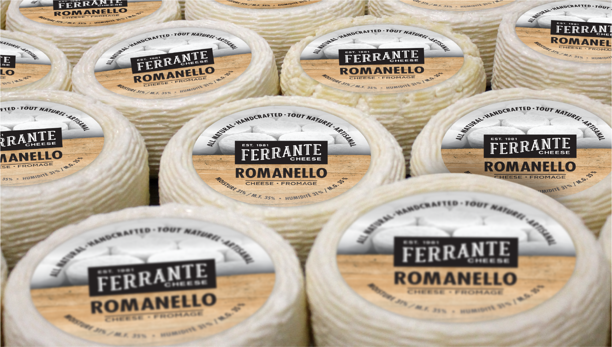
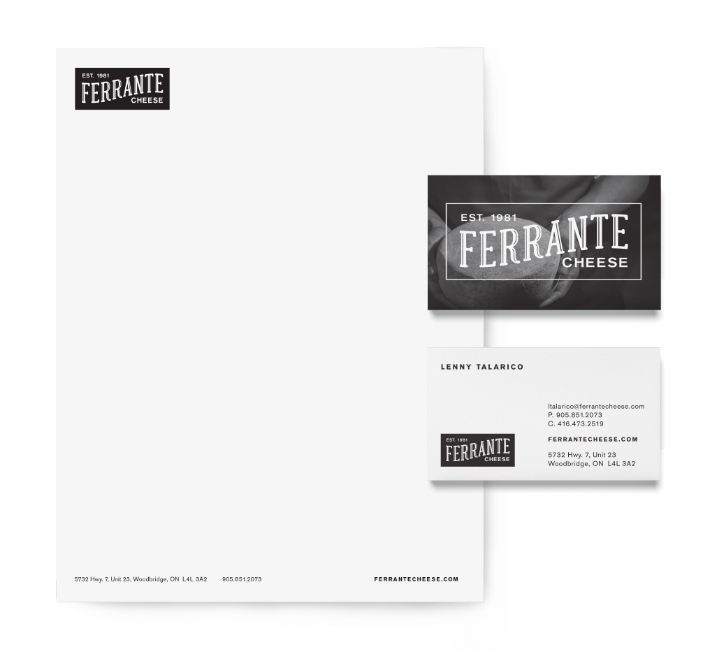
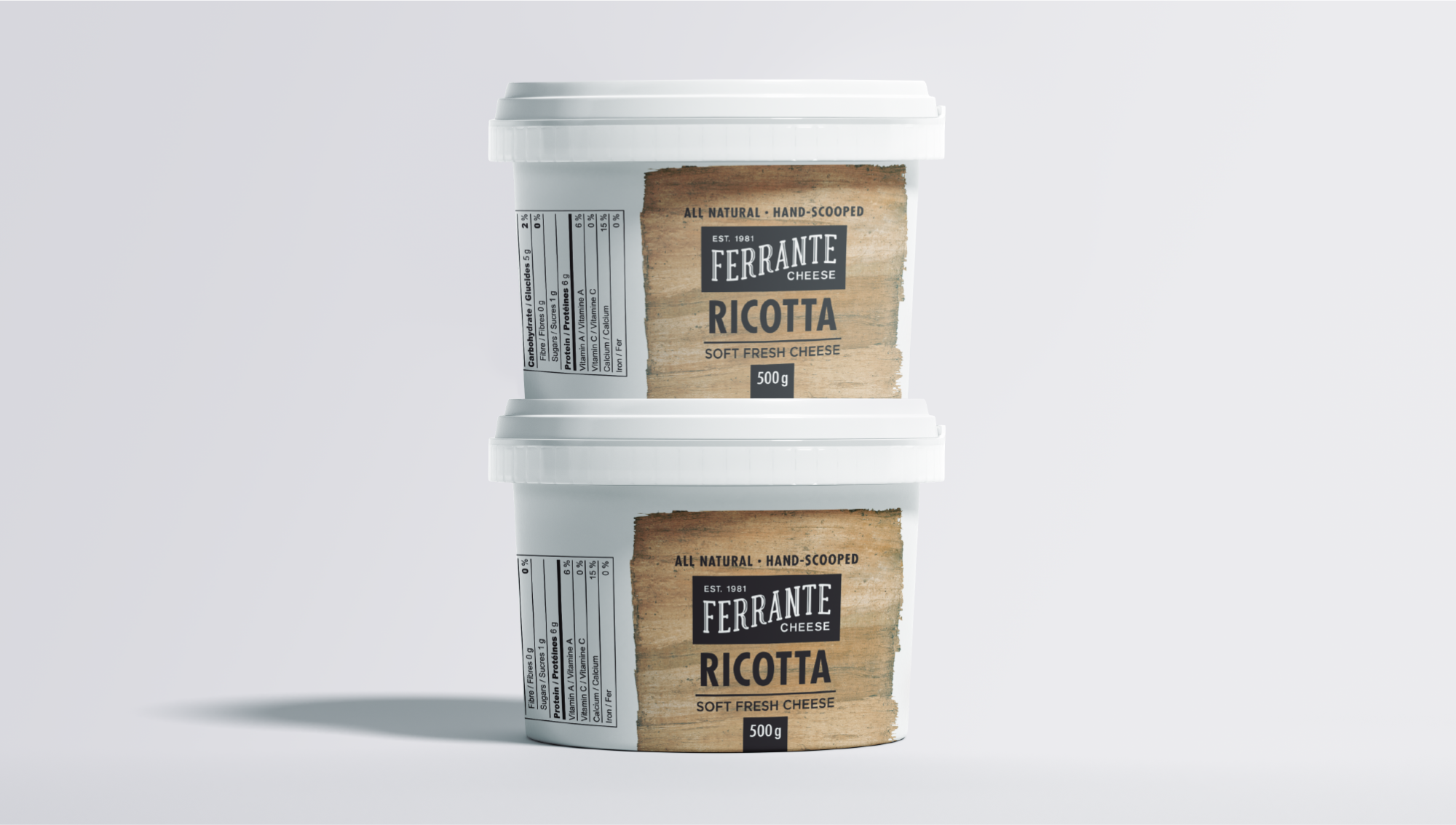
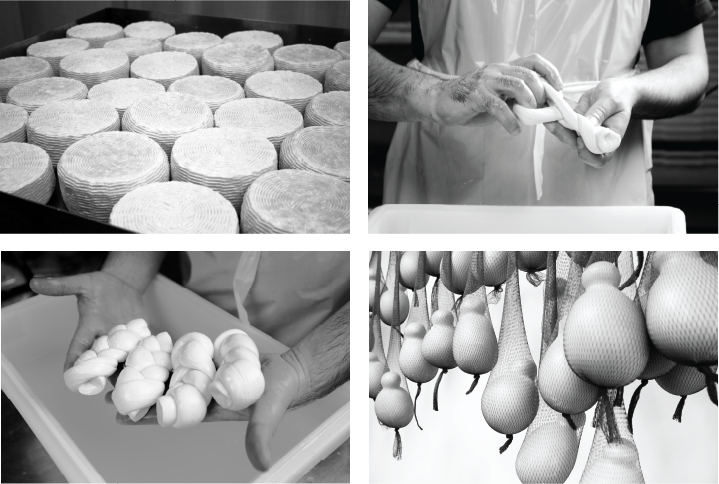
To bring authenticity to the brand, the cheesemaking process was photographed. These black and white, vintage-inspired photos were used to tell a story on packaging and marketing materials. To further expand upon the rustic, handcrafted feel of the brand, a warm natural wood element was incorporated to add contrast and texture against the bold, black typographic treatment.
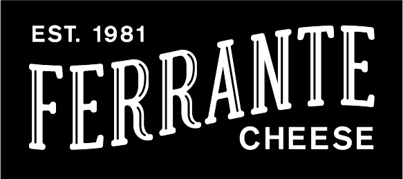
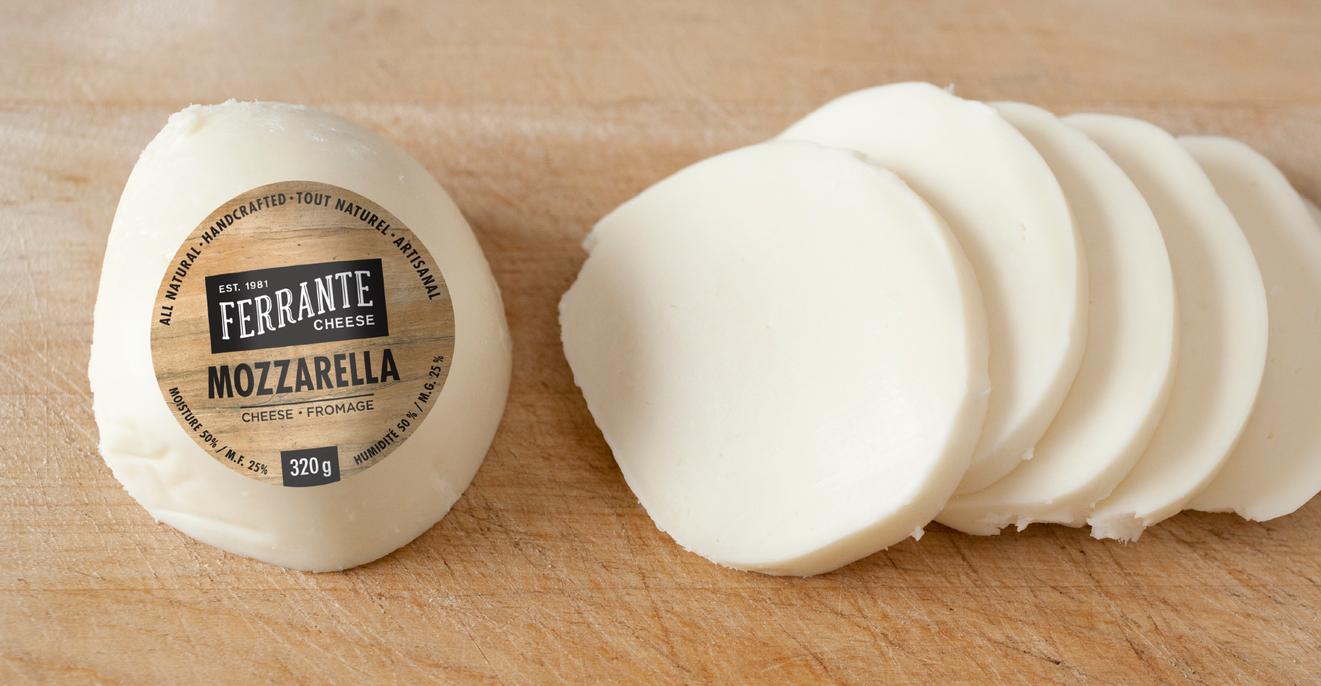
The new logo is bold, striking the perfect balance of old-world and contemporary styling, to combine the values of the brand into one cohesive unit.
THE RESULT
The new Ferrante Cheese brand is fresh and exciting, with a nod to its heritage – much like their cheeses. The new packaging has a commanding in-store presence that not only attracts attention, but also speaks to the quality and excellence the company has built its reputation on.