MARIPOSA DAIRY
LOGO • BRANDING • WEBSITE • ENVIRONMENTAL DESIGN • VEHICLE GRAPHICS • SELL SHEETS • BANNER STANDS • BRAND STANDARDSStarting from humble beginnings in 1989, on a family farm near Lindsay Ontario, Mariposa Dairy has become nationally recognized for their award-wining, high-quality goat cheese products ranging from fresh chevre to aged cheeses.

THE BRIEF
As the Mariposa Dairy business continues to grow at a rapid rate, it became obvious that it was time to reinvent the brand to reflect their ambition, professionalism and company beliefs – to invent a new brand identity that would pay homage to their heritage yet take on a modern twist.
THE APPROACH
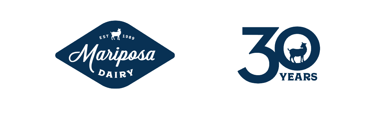
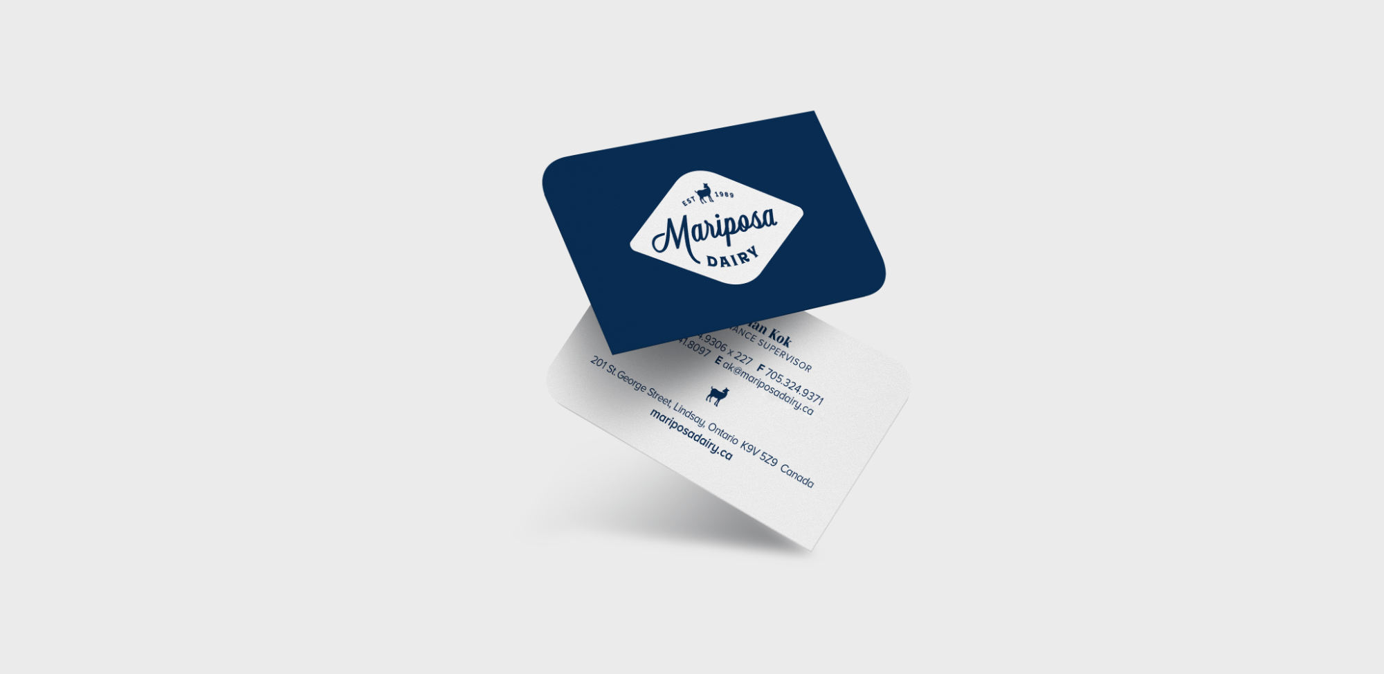
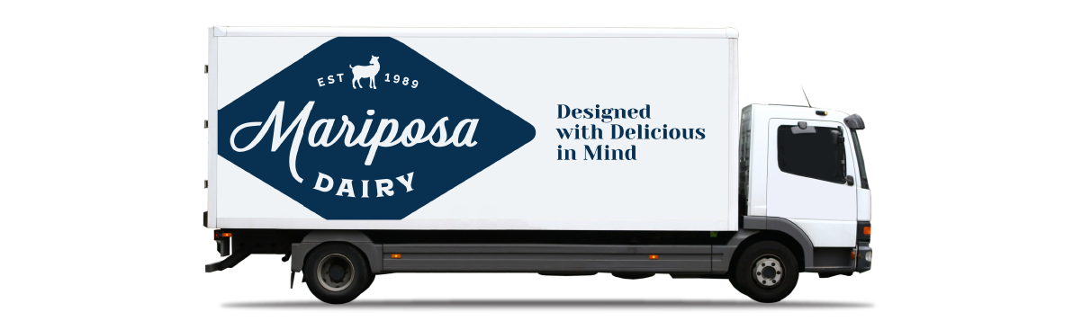
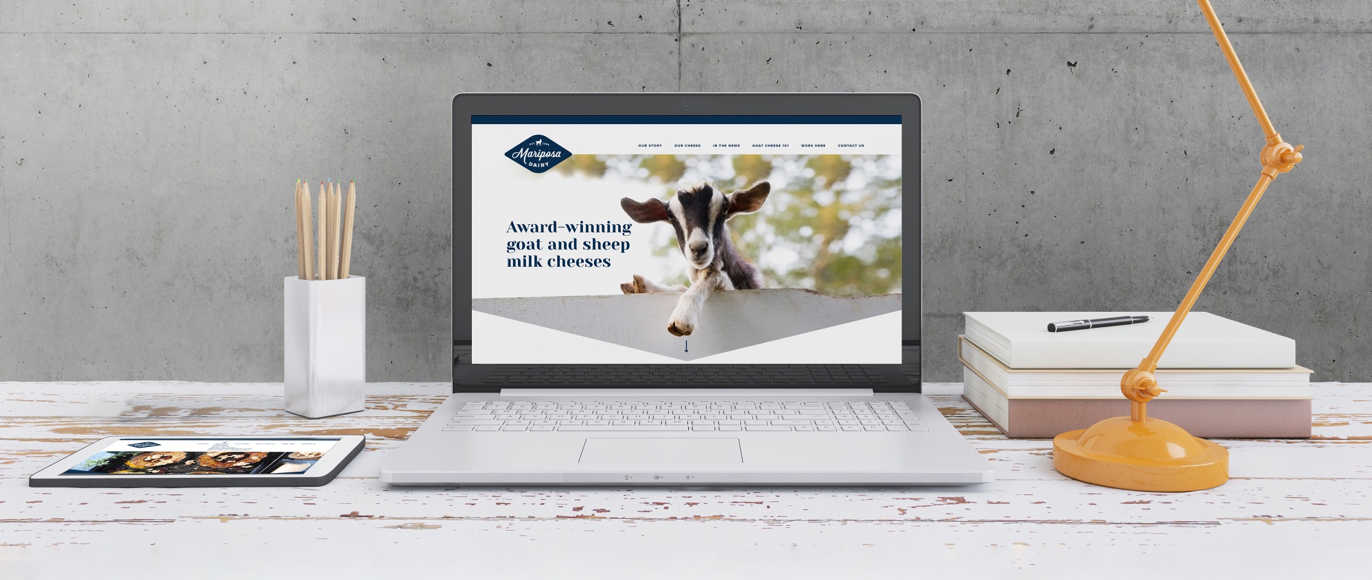
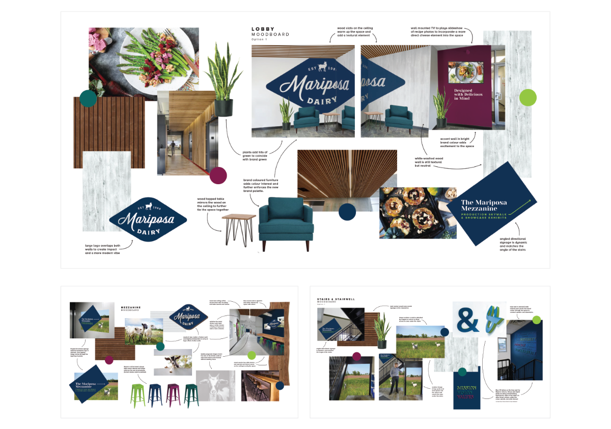
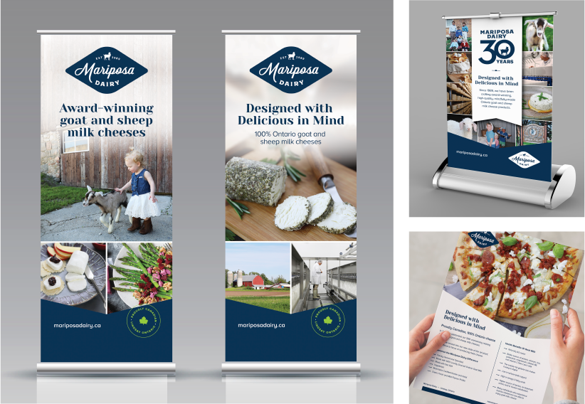
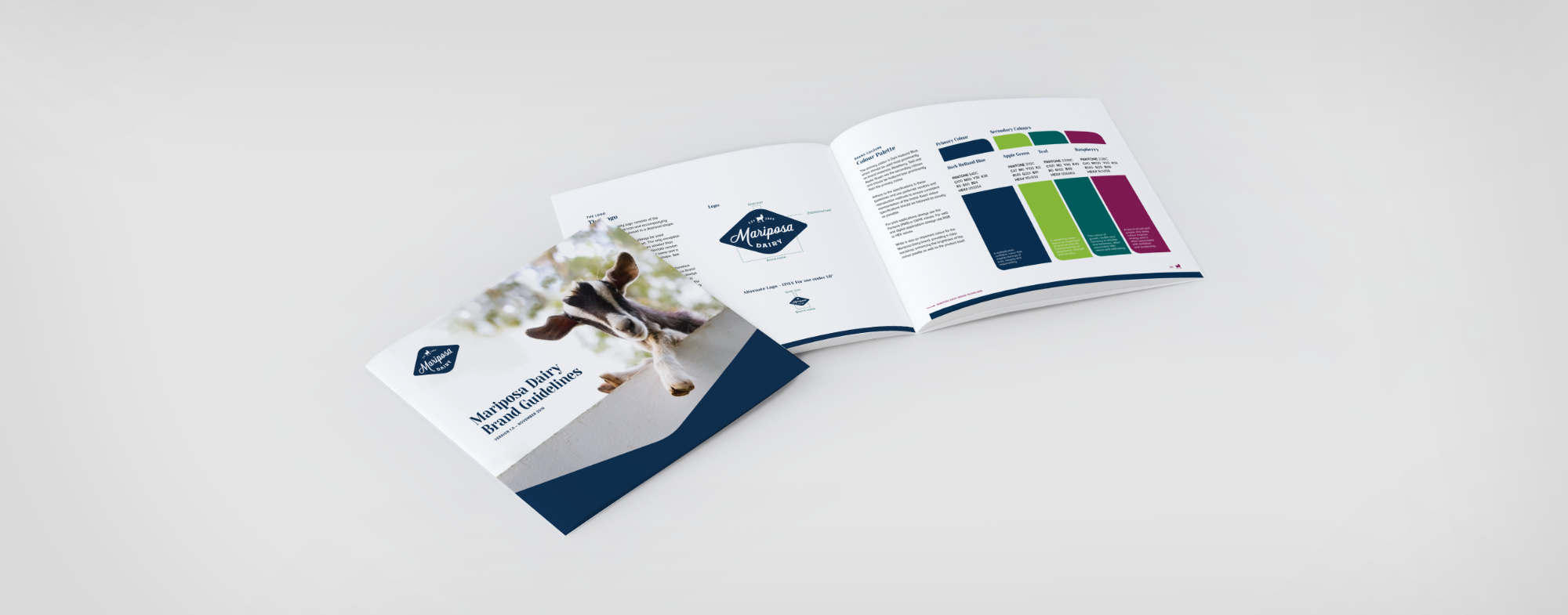
The development of a retro-inspired chevron shaped logo set the stage for all other marketing materials. The chevron graphic is used across varying pieces to add a strong visual and graphic element. A new colour palette was created to energize the brand and set them apart from their competitors. Through the use photography from their farm and production plant along with images of their livestock, family and award-winning products, the story of Mariposa Dairy shines.
THE RESULT
An approachable brand that depicts Mariposa Dairy’s family roots and values, professional ambition and award winning cheeses.