Linden Valley Gourmet
WEBSITE • BRANDING • PACKAGING
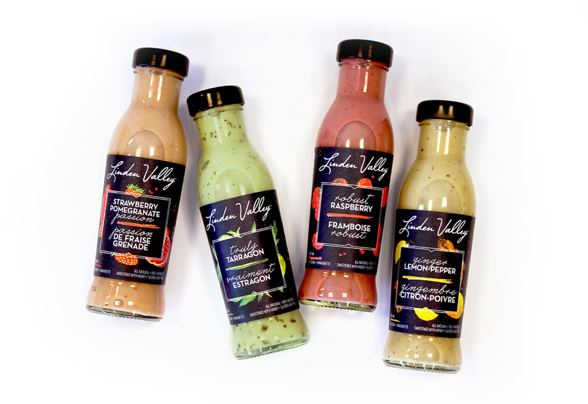
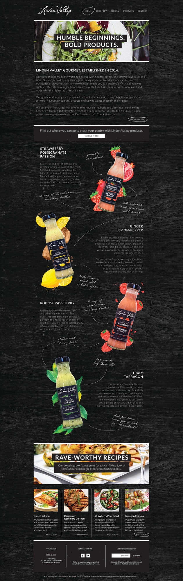
Linden Valley Gourmet creates small-batch, one-of-a-kind dressings using fresh, real ingredients that nourish the body and offer health-enhancing benefits with every bite.


THE BRIEF
Passionate about making healthy foods taste amazing, Linden Valley needed a brand that was every bit as sophisticated as the dressing it creates. As a brand new company, Linden Valley was in need of an identity, a website and a series of label designs that would not only stand the test of time, but pop out on shelves in a saturated specialty food market and appeal to high-end grocers and individual foodies alike.
THE APPROACH
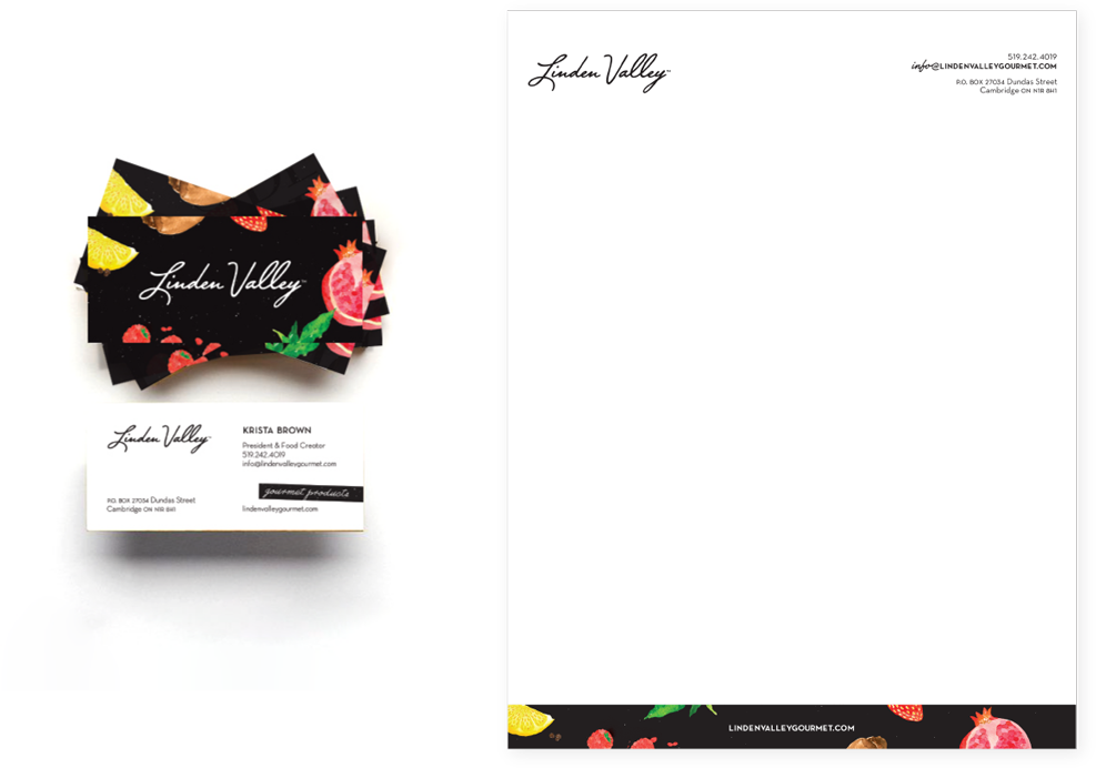
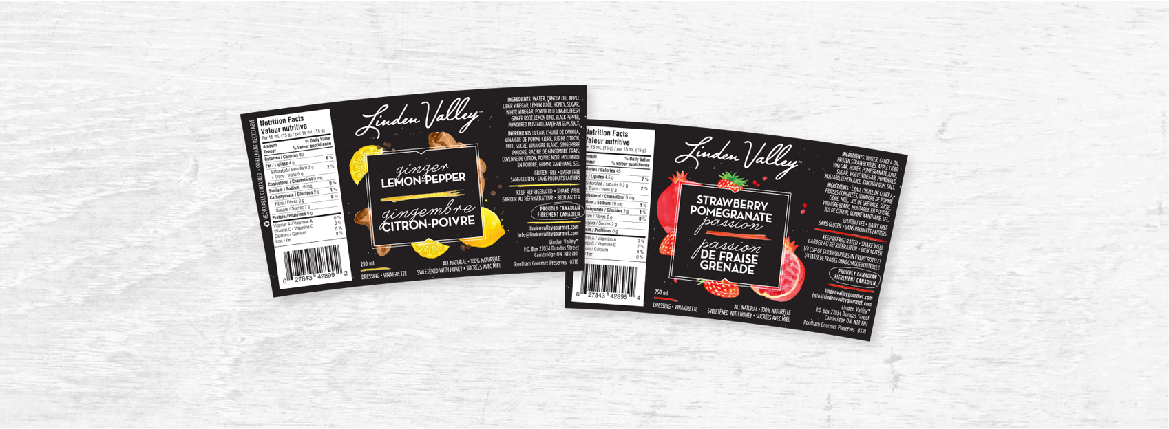
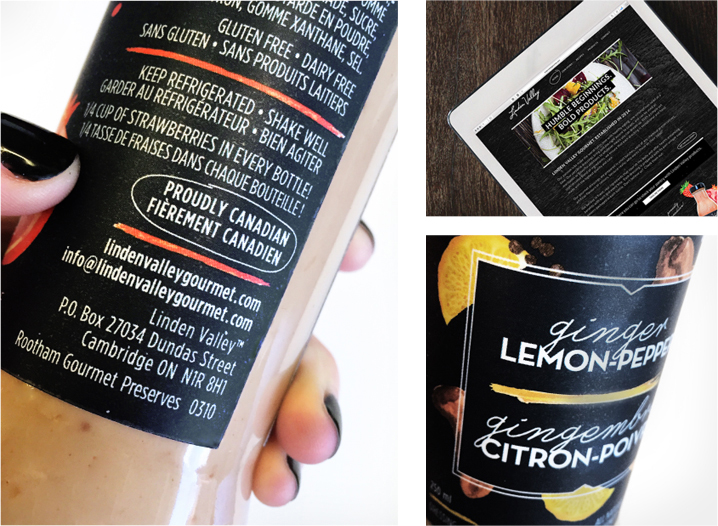
Bold colours and artisan style are used to create a simple, but standout design that represents Linden Valley’s handcrafted deliciousness. The wordmark is easily recognizable and integrates seamlessly into packaging, while bright illustrations combine with texture to take this homegrown brand to the next level.
The all-black label has an air of sophistication and exclusivity, but playful design elements keep the brand fun and approachable.

THE RESULT
Well, we couldn’t have said it better ourselves!
“The Blondes design is the face of my company. I was looking for something very specific, and they absolutely nailed it. I’d like to think that my dressing is amazing, but new vendors just look at my bottles and say ‘this is going to sell’ – they don’t even have to taste it.”
Krista Brown
President & Food Creator, Linden Valley Gourmet