BergSMA & LAURETTE RECRUITEMENT GROUP
WEBSITE • BRANDING
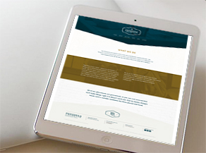
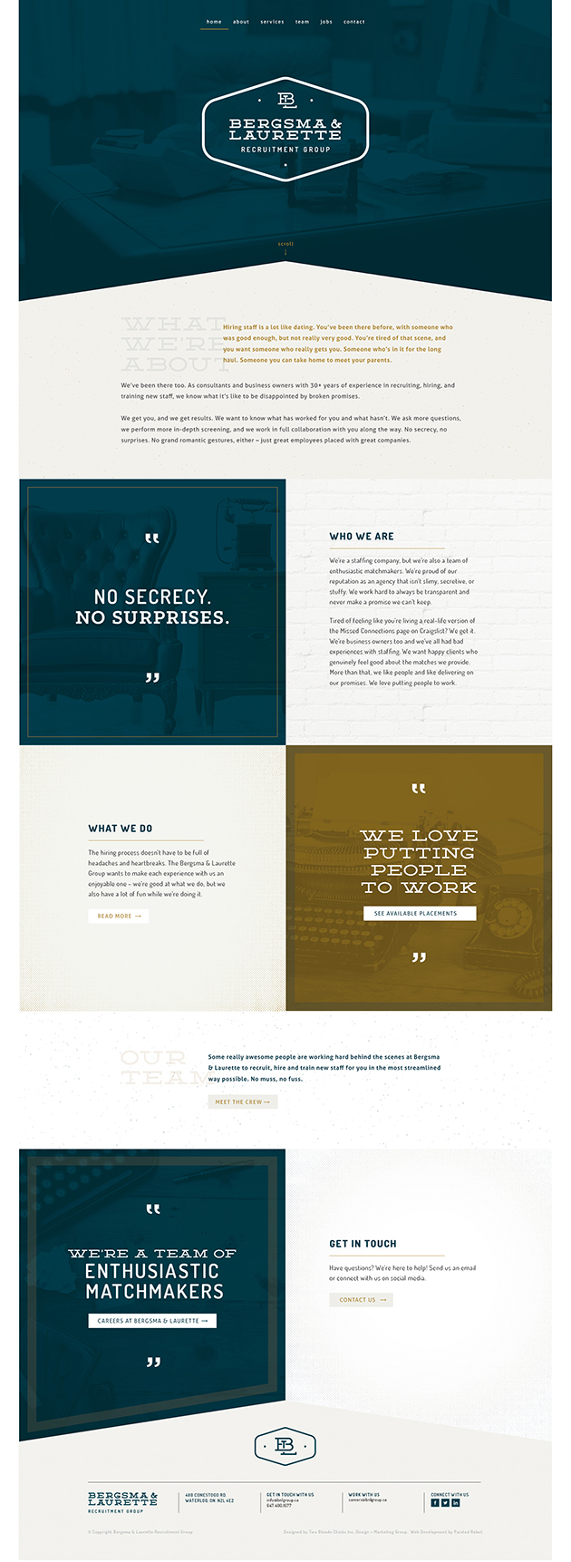
Bergsma & Laurette is a staffing company that collaborates with clients and provides in-depth screening to match great employees with great companies.

THE BRIEF
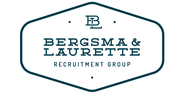
Bergsma & Laurette came to us with a vision – a retro style brand that was sophisitcated, but not too serious or corporate – a unique and memorable brand with personality. Not just a recruitment group or staffing company, they are a team of enthusiastic matchmakers who truly love what they do and always look to match people with companies to build relationships that make sense.
THE APPROACH
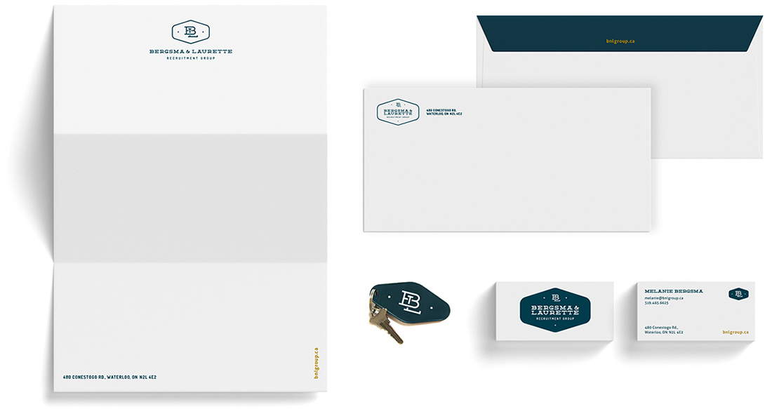
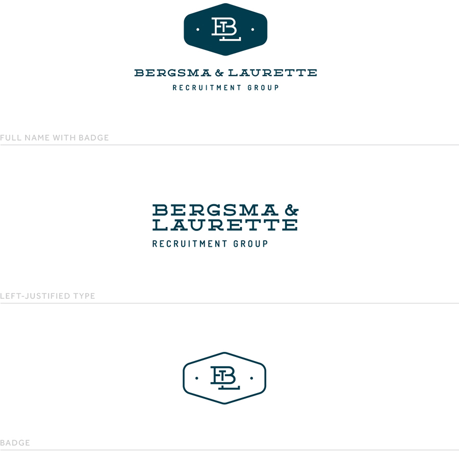
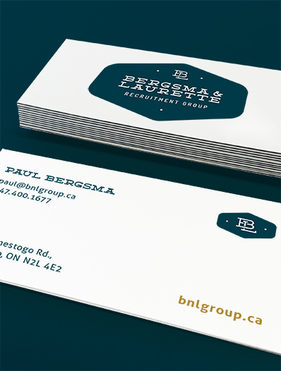
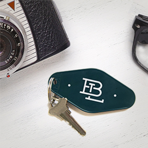
Bold, stylish fonts combine with a retro shape – inspired by vintage motel keys – to give the Bergsma and Laurette brand lots of personality. A rich, dark teal takes the sophistication of the brand to the next level when combined with gold coloured accents. The result is a retro brand with just enough modern elements and appeal. Quadplex business cards (black paper sandwiched between layers of white) are thick and luxourious. This detail combined with an untraditional long and thin card shape enforces the unique personality of the Bergsman & Laurette brand.

THE RESULT
Bergsma & Laurette are passionate about their new brand and confidently stand apart from their competition.